Showing posts with label maps. Show all posts

Wednesday, November 20, 2024

GIS Day 2024 Event at FDOT District 7

Following months of planning, of which I contributed starting on the second day of my internship, GIS Day is finally here! Beyond brainstorming ideas in which to better spread the word at FDOT District 7 of the event, I was tasked with creating one or two GIS Day maps for display on the wall of the auditorium.

As the semester progressed, I took inspiration from Special Topics assignments and learned skills from Computer Cartography and GIS Applications for several mapping concepts to share on GIS Day. My idea was to show a few examples of the capabilities of GIS, both from an analytical standpoint, and also in the different ways data can be visualized.

After reading several classmates discussion board posts on presentations they made for GIS Day, I decided to follow their lead and create a presentation of my own. My goal was to provide an overview of maps in GIS, then cover each of the five maps I created with a mix of technical information such as the geoprocessing that went into it or the type of map (choropleth, graduated symbol), principles of design, and inspiration for the map subjects.

Our efforts paid off, and the D7 GIS Department's three hour event this morning was a great success! We had around 30 attendees, many of which stayed for all presentations, and received several positive comments on the event. My presentation went over well and I thoroughly enjoyed sharing some of the GIS knowledge gained from my time with the University of West Florida.
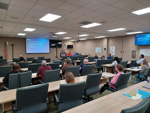
The start of 2024 GIS Day at FDOT District 7
2024 GIS Day at FDOT District 7

My GIS Day 2024 presentation and the maps I created for the event follow:

D7 GIS Day Map Overview

There are two general categories of maps, Reference maps and Thematic maps. We are all familiar with Reference Maps, such as a road map or a political map. On display in the auditorium here are examples of Thematic Maps, which are maps that focus on a specific theme, such as climate, population, or in our case, transportation. This leads me into our first GIS Day map…

Hurricane Tracks Map
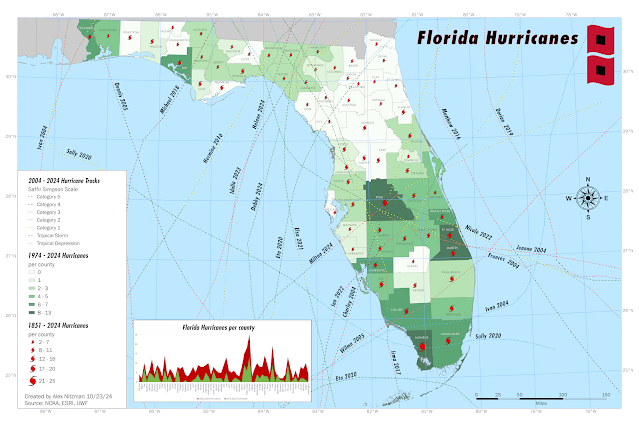
Map quantifying the number of hurricanes striking Florida from 1851 to 2024
Florida Hurricanes quantifying direct impacts from 1851 to 2024

When we were planning our GIS Day event, one of the map concepts discussed was a Florida map of hurricane tracks impacting the state over the last 20 years. Sounds simple enough, but as the map was in production, Hurricane Milton formed, and one fact mentioned by media outlets was that Tampa had not been hit directly by a major hurricane since 1921.

This ultimately factored into me deciding to expand upon the hurricane tracks map concept to quantify the number of hurricanes that have directly passed, the center that is, over each county in the state.

I opted to cover two sets of temporal data. A choropleth map shows the number of hurricanes per county in the last 50 years. It uses dark colors for higher values, conveying that higher values have a heavier visual weight. The graduated symbols map, which quantifies the number of hurricanes per county since 1851, the first Florida hurricane in the dataset, correlate size of the symbol with quantity, i.e. larger means more.

As for how the map was created, the geoprocessing for the choropleth and graduated symbols maps were based upon the number of hurricane polylines crossing any part of the county polygons. These calculations are automatic in GIS and no manual comparisons are needed.

D7 Interstates History Map

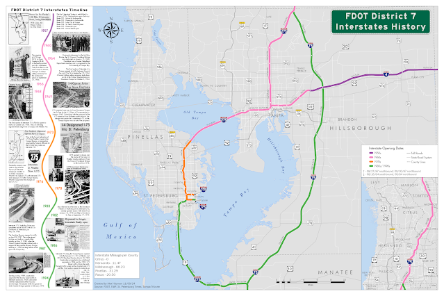
Map showing the opening dates of every mile of the Interstate system within FDOT D7
FDOT District 7 Interstate opening dates color coded by decade

This thematic map aggregates sections of the District 7 Interstate system by the decade in which they opened to traffic. This also shows how the use of graphics can enhance the presentation of a map.

I also factored into the design the Gestalt Principles of Perceptual Organization, which in cartography includes Visual Hierarchy, where important features are emphasized, and less relevant ones deemphasized. The Figure-Ground relationship accentuates certain objects over others by making these appear closer to the map user. Visual Balance is where the size, weight and orientation of map elements are adjusted to achieve balance in the center of the map. Contrast and Color are other principles used in good map design.

D7 Lighting Raster Map

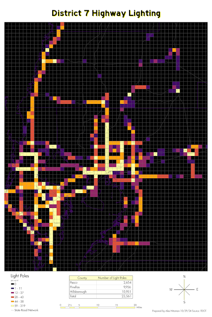
Raster showing the number of light poles per square mile in FDOT District 7
Raster quantifying light poles in FDOT District 7

I created this map to show how raster data can be used by GIS. The concept took the point feature class for all light poles within District 7 and overlayed them with a fishnet grid in ArcGIS Pro. This is also referred to as grid-based thematic mapping. I aggregated the light poles by 1 square mile grid cells and obtained a density unit via geoprocessing. I then symbolized the raster set where lighter colors convey more light fixtures. The end result is a map clearly showing where we maintain the most lighting.

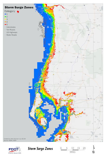
D7 Storm Surge Map

Storm Surge map for FDOT District 7
Areas in FDOT District 7 inundated for storm surge by Saffir-Simpson category

Storm surge data is another form of raster data. These are generally calculated by the use of a Digital Elevation Model or DEM. One useful aspect of ArcGIS Pro is the ability to use geoprocessing to convert a raster into a polygon feature class, such as was done here with this NOAA storm surge dataset.

This expands the options for the GIS analyst. Among others, geoprocessing options include least cost path analysis, buffer analysis, and data interpolation, where unknown values between known data points such as rainfall rates, can be estimated.

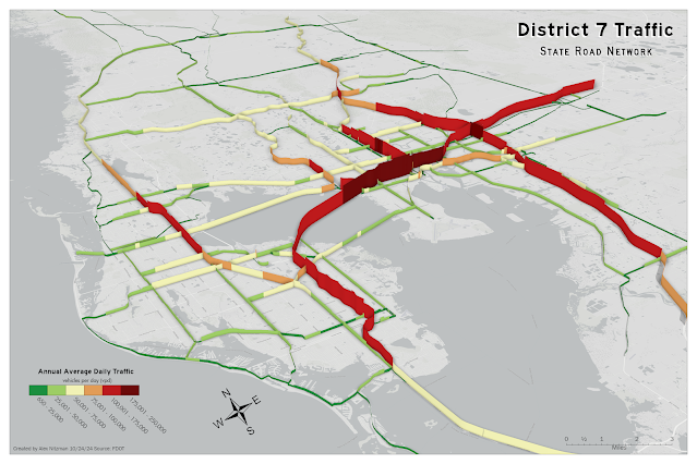
3D Traffic Count Map

3-Dimension map of traffic volume (AADT) for FDOT District 7
3-Dimensional representation of traffic counts (AADT) on the FDOT D7 state road system

When you think of 3D mapping, you probably think of modeling buildings or terrain, but there are several other uses. One such concept of 3D mapping is to visualize 2D data in a different, and perhaps more thought-provoking way.

That was the idea behind this 3D traffic count map of District 7. ArcGIS uses the Extrusion method to add a 3D element to our 2D feature class. Extrusion bases the height of data on a Z-unit, where the unit can be based upon real-world units, such as the height of a building, or upon ranges of data, such as with the traffic counts here.

ArcGIS Pro renders data three dimensionally differently for points, polylines and polygons. Points will appear as columns. Polylines will appear as a wall, as it does here, and Polygons appear as solid objects, which is probably easiest to imagine when applied to a building footprint.

One thing revealed with this 3D traffic count map was that a stretch of traffic count data for Interstate 4 was missing. So, the 3D map produced an unintended benefit, revealing a section of missing data that we could correct.

So, as you can see, GIS allows you to show geospatial data in a more meaningful way. And these maps are only the tip of the iceberg when it comes to the types of deliverables that can be produced.
Wednesday, October 9, 2024

GIS Internship - Training and Hurricanes

The internship with the Florida Department of Transportation (FDOT) at District 7 Headquarters has been quite eventful. I got started a bit later in the semester through the Volunteer Program, so I am approximately one third through the hours for GIS. Beyond mandatory training for state employees, I got started on putting together a training manual for ArcGIS Pro desktop to be used by the GIS Department in future classes for general employees. I also have partaken in weekly GIS Check-in and GIS Day Progress meetings.

Things changed two weeks ago with the expected development of what became Hurricane Helene in the Northwestern Caribbean Sea. From the beginning the projected path focused on the west coast of Florida and Big Bend region. Either way, the counties within District 7 would be affected, so the focus of FDOT shifted from routine day-to-day operations to storm preparation and emergency management applications.

Additionally the office closed for a couple of days and work-from-home was implemented for most employees. Being an intern, that left me waiting until the following week to resume work. But since I am considered an employee, I could still partake in Microsoft Teams communications from my home PC. So I was able to assist in putting together storm surge inundation graphics for upper management using raster data provided in the NHC Data in GIS Formats downloads page.
NHC Storm Surge Inundation Raster Data for Tampa Bay
Potential Storm Surge Inundation for Hurricane Helene with Florida State Roads

Just over a week removed from Hurricane Helene, Tropical Storm Milton quickly formed within the Bay of Campeche over the southwestern Gulf of Mexico. The initial forecast track immediately targeted the Tampa Bay region. So again the focus at FDOT D7 shifted to emergency management operations and storm preparedness. The biggest difference this time was that FDOT played a role in logistics with relocating the massive amount of debris along the Pinellas County coastline that was the result of Hurricane Helene's storm surge.

The office closed again on Tuesday October 8 and remained close through Thursday. This meant my internship was again on hold, but similar to Helene, I could still contribute GIS related graphics from home. Storm surge being the biggest concern again, I put together another storm surge inundation map with GIS data downloaded from the NHC.
NHC raster data for Hurricane Milton storm surge inundation 10/09/24
Hurricane Milton NHC Storm Surge Inundation for Tampa Bay with Florida State Roads

With the knowledge gained from class, I can quantify this data to show the total mileage of Florida State Roads potentially inundated by storm surge. Then by Calculating Statistics, aggregate the percent of state roads effected by county. One thing I have learned thus far with my internship at FDOT is that the turnaround time for producing a deliverable is often very short. Any premade styling or formatting is absolutely necessary and fine tuning an output map is more of a luxury than a necessity.

10/15/24 Update, after 120 hours of no electricity, water or internet due to Hurricane Milton, I finally have the opportunity to created a LinkedIn profile! While I have known about this platform for many years, my internship and recent classes gave me the impetus for making an account.

My approach to setting up the initial profile was to cover as many aspects of my experiences with Geographic Information Systems (GIS) and geography in general. Barring anymore hurricanes and as I get more time, especially as my internship with FDOT progresses, I will further expound upon my GIS work and classes with my profile.

Sunday, September 15, 2024

Searching for the right GIS job

Finally got started with my GIS Internship with the Florida Department of Transportation at District 7 (D7) Headquarters last week. The position affords me the opportunity to work on several GIS related tasks and with multiple departments. I am working with a great team and providing assistance to others with ArcGIS Pro.

Settling into my internship position at D7 went very smoothly. My initial task is working on a basic training manual for ArcGIS Pro to be used in future courses that the GIS department will offer employees. Additionally I was invited to join planning meetings for this year's GIS Day, which will include demonstrations and information on how various departments across D7 use GIS. I am excited to contribute ideas and provide input, and this will also aid in my eventual GIS Day assignment for GIS4944!
GIS Day - November 20, 2024

One of the assignments for this week in GIS4944 is to conduct a job search for what we could consider to be our Dream GIS Job. Working on road map production for a major mapping company in GIS would be it, but the paper map industry is minimal and becoming more niche. So my second GIS job choice is working in transportation. My positive experiences after two days at FDOT have already reinforced this! 

The job that is most appealing in my search is for a GIS Analyst I for the Texas Department of Transportation (TxDOT). Generally all of the essential duties listed in the job posting fall somewhere within my knowledge wheelhouse. Collecting, preparing and digitizing GIS data is the first listed. Create, maintain, update GIS databases and cartographic products is another duty. Extraction of features from georeferenced scanner paper maps is a third duty that I have experience with. Even the bullet point referencing converting CAD and other formats into ArcGIS formats is a task I likely could master, given previous work with CAD at Mapsource and Adobe Illustrator for AARoads.

The position requires no prior experience, but a Bachelor's Degree in Geography, GIS or a related field is. However, the posting reveals that relevant work experience may be substituted for a degree on a year per year basis. I am confidence I can meet this requirement through my previous work with Mapsource, Universal Map Group, and GIS Cartography & Publishing Services, in addition to our coursework in the UWF GIS Certificate program.

The results of the GIS job search gave me a framework for what to look for in future job searches. The TxDOT position is about as optimum as I could get for both my skillset and interests. A job description for a GIS analyst position with FDOT would likely be similar. However, with ongoing budgetary issues, no positions at FDOT will be posted in the near future. There's always the private sector to consider as well.

Friday, September 6, 2024

Spatial Data Quality - Road Network Completeness

Continuing the focus on Spatial Data Quality in GIS Special Topics, Module 1.3 covers the Accuracy Assessment of Roads. Road networks are widely used as the basemap for many applications. This factors into expectations for positional accuracy and completeness, which this week's lab covers.

Road networks are also used for geocoding and network routing. The usability of such is dependent upon robust attributes such as street names, address numbers, zip codes in addition to networking aspects such as turn restrictions and one-way directions. Topologically, road networks must also be robust, with exact connectivity found in reality (Zanbergen 2004).

Typically road network datasets are compiled from an array of historical sources, with digitization from aerial imagery and augmentation from GPS field data collection. One of the most comprehensive datasets in the U.S. with a long lineage is TIGER (Topologically Integrated Geographic Encoding and Referencing).

Produced by the US Census Bureau for 1:100,000 scale maps (Syoung & O'Hara, 2009), TIGER was originally compiled to be topologically correct. That is data was not focused on being as accurate as possible, but instead data stressed connections and boundaries. (Zanbergen 2004) This resulted in legacy errors, which were carried over in succeeding updates from 2000 onward.

TIGER roads centerline data for Jackson County, Oregon

Covered in the last week's lab, accuracy assessment of roads utilizes methods such as "ground-truthing" using GPS or surveying equipment, comparing roads with high resolution imagery, and comparing roads to existing datasets deemed to be of higher accuracy.

Positional accuracy last week looked at the comparison of points between two datasets using root-mean-square-error (RMSE) with reference or true points. Additional methods include using buffers. This is where the true line is buffered with some distance to show discrepancies. It is also used to determine where displacements between matching features fall within an expected nominal accuracy. (Syoung & O'Hara, 2009) In other words data located in areas outside a buffer (specified tolerance) are deemed to be substantial errors.

Another method for positional accuracy is line displacement. This is where the displacement of various sections of a polyline are measured using Euclidean distance. Using matching algorithms, errors show the displacement of one road network from another. These displacements can be summarized (Zanbergen 2004), or be represented as a raster dataset to analyze vector geometry (Syoung & O'Hara, 2009).

The lab assignment for Module 1.3 conducts accuracy assessment for completeness on two datasets of street centerlines for Jackson County, Oregon. The feature classes are TIGER road data from 2000 and a Streets_Centerlines feature class compiled by Jackson County GIS.

Street Centerlines Data from Jackson County, Oregon GIS
Street Centerlines data from Jackson County, Oregon GIS

Completeness is one of the aspects cited by Haklay (2010) in accessing data quality. Completeness is the measure of the lack of data, i.e. how much data is expected versus how much data is present. Zanbergen (2004) references measuring the total length of a road network and comparing that to a reference scenario and secondly counting the number of missing elements as a count of features.

Both accuracy assessment scenarios for completeness overlay an arbitrary grid cell over compared datasets to determine the total length of count in a smaller unit. Then a comparison between two sets of roads based on a total length can be determined.

Haklay (2010) references completeness as asking the question of how comprehensive is the coverage of real-world objects. Generalizing this as a simple measure of completeness for our analysis, the dataset with the higher total length of polylines is assumed to be more complete.

Our analysis proceeds by projecting the Tiger roads data into StatePlane coordinates to match the other provided datasets. The shape length of each polyline in kilometers is calculated from feet into a new field for each road feature class. Statistics for total length of all road segments per dataset are then summarized for the initial assessment of completeness, where the dataset with more kilometers of roads is considered more complete.

The results were 10,805.82 km of roads for the County Street Centerlines feature class and 11,382.69 km for the Tiger roads feature class. With more data, the Tiger roads data is considered more complete.

Further accuracy assessment for completeness continues with a feature class of grid polygons to be used as the smaller units for comparison. Both feature classes were clipped so that all roads outside of the 297 grid cells were dropped. Geoprocessing using the Pairwise Intersect tool separates each road centerline dataset by grid. This provides a numerical summary indicating a simple factor of completeness on a smaller scale.

The collective length of Tiger road segments exceeds the County street centerline segment length in 162 of the 297 grid cells.
The collective length of County street centerline segments exceeds the Tiger road segment length in 134 of the 297 grid cells
Additionally one grid cell contained zero polylines for either centerline dataset.

Visualization of these results shows the percent difference for the length of Tiger roads centerline data as compared to the County roads centerline data. Statistics were calculated using a  mathematical formula:
% π‘‘π‘–π‘“π‘“π‘’π‘Ÿπ‘’π‘›π‘π‘’ = (π‘‘π‘œπ‘‘π‘Žπ‘™ π‘™π‘’π‘›π‘”π‘‘β„Ž π‘œπ‘“ π‘π‘’π‘›π‘‘π‘’π‘Ÿπ‘™π‘–π‘›π‘’π‘  − π‘‘π‘œπ‘‘π‘Žπ‘™ π‘™π‘’π‘›π‘”π‘‘β„Ž π‘œπ‘“ 𝑇𝐼𝐺𝐸𝑅 π‘…π‘œπ‘Žπ‘‘π‘ )/(π‘‘π‘œπ‘‘π‘Žπ‘™ π‘™π‘’π‘›π‘”π‘‘β„Ž π‘œπ‘“ π‘π‘’π‘›π‘‘π‘’π‘Ÿπ‘™π‘–π‘›π‘’π‘ ) ×100%
Completeness is aggregated where cells with more kilometers of Tiger roads than County roads appear in reds and oranges and shades of green where the collective length of County roads polylines exceeds the length of the Tiger roads data.

Length comparison between County street centerline data and TIGER roads data
Map showing the geographic distribution in the differences of completeness for the two road datasets

References:

Zanbergen (2004, May). Spatial Data Management: Quality and Control. Quality of Road Networks. Vancouver Island University, Nanaimo, BC, Canada.

Suyoung & O'Hara (2009, December). International Journal of Geographical Information Science 23, 1503-1525.

Haklay (2010, August 1). Environment and Planning B: Planning and Design, 37, 682-703. 


Sunday, August 4, 2024

Least-Cost Path and Corridor Analysis with GIS

The second half of Module 6 for GIS Applications conducts Least-Cost Path and Corridor Analysis on two scenarios. The first continues working with the Jackson County, Oregon datasets from Scenario 2.

There are several ways that GIS measures distance. Euclidean, the simplest, represents travel across a straight line or "as the crow flies". Manhattan distance simulates navigating along a city street grid, where travel is restricted to either north-south and east-west directions. Network Analysis models travel in terms of time, where travel is restricted by a road network or transit infrastructure.

Least-Cost Path Analysis models travel across a surface. It determines the single best course, a polyline, that has the lowest cost for a given source and destination, which are represented by points. This can be described as the routing over a landscape that is not restricted by road networks. 

The course through the landscape is modeled as a cost. More specifically each cell in a cost raster has a value which represents the cost of traveling through it.

Typical cost factors are slope and land cover. A cost surface can vary from just a single factor to a combination of them. Even if multiple factors are considered, the analysis only uses a single cost raster.

Least-Cost Path Analysis can be expanded to Corridor Analysis. Instead of resulting in a single base solution represented by a polyline, corridor analysis produces multiple solutions, representing a zone where costs are close to the least cost. The corridor width uses is somewhat subjective. It is controlled by deciding what range of cost to consider. Values of a few percentage points above the lowest cost to as much as 10% above the lowest cost are common.

Scenario 3 uses least-cost path analysis on an area of land in the planning for a potential pipeline. Cost factors include elevation, proximity to rivers and potential crossings of waterways. Datasets used for these cost factors include a DEM, a rivers feature class and feature classes determining the source and destination of the proposed pipeline. Analysis proceeds focusing on each cost factor individually.


Geoprocessing Flowchart for Scenario 3 - Analysis D
Geoprocessing flowchart for least-cost path analysis factoring solely on slope

Focusing first on the DEM, the raster is converted to a slope raster, and subsequently reclassified using a cost factor range of eight values. The next analysis step utilizes the Cost Distance geoprocessing tool. Using an iterative algorithm, a cost distance raster is generated that represents the accumulated cost to reach a given cell from the source location point.

A cost backlink raster is also created, which traces back how to reach a given cell from the source. This reveals the actual path utilized to obtain the lowest cost. The actual cell values of the backlink raster represent either cardinal directions or the intercardinal point (NE, NW, etc.) instead of cost. The combination of the two output rasters contain every least cost path solution from the single source to all cells within the study area.

Cost Distance Raster
Cost Distance Raster - Values represent the cost of traveling through a cell
Cost Distance Backlink Raster
Cost Distance Backlink Raster - Values correspond with compass directions

The final step of least cost path analysis obtains the least cost path from the source to one or more destinations. The result of the Cost Path geoprocessing tool, this consists of a single polyline representing the lowest accumulated cost.

Output least-cost path and DEM for a proposed pipeline in Oregon
The result of Least-Cost Path Analysis solely on slope

Continuing our analysis of a proposed pipeline in Jackson County, Oregon, we factor in river crossings as a cost factor.

Geoprocessing Flowchart for Scenario 3 - Analysis E
Geoprocessing flowchart for least-cost path analysis factoring in both slope and river crossings

The result of factoring in river crossings to the cost analysis reduces potential crossings to five from the 16 when factoring in slopes alone:

Least-Cost Path Analysis factoring in both river crossings and slope

Furthering our analysis, we change from factoring in river crossings to instead factor in the distance to waterways. Using a multiple ring buffer, cost factors are set high for areas within 100 meters of hydrology and moderate for areas within 500 meters. Distances beyond 500 meters from a waterway are zero, reflecting no cost.

Geoprocessing Flowchart for Scenario 3 - Analysis F
Geoprocessing flowchart for least-cost path analysis factoring slope and proximity to waterways

As the cost factor criterion for the least-cost path analysis is adjusted to better compensate natural factors, the least cost path adjusts accordingly:
Least-Cost Path Analysis with the cost factors of Slope and Proximitys to Waterway
The final analysis for third scenario looks at Least-Cost Path Corridor Analysis, which not only includes the least-cost path, but also a multiple of other least-cost alternatives within a corridor determined on a case-by-case basis.
Geoprocessing Flowchart for Scenario 3 - Analysis G
Geoprocessing flowchart for least-cost path corridor analysis

The geoprocessing to develop the least-cost path corridor utilizes the previously generated cost raster factoring in the proximity to waterways and slope. Instead of using the source point as the feature source data, the Cost Distance tool is based off the destination point feature class.

Together the two cost distance rasters, one based off the "destination" feature class and the other off the "source" feature class, are input into the Corridor geoprocessing tool. This outputs the Least-Path Corridor raster, which areas of least-cost paths symbolized based upon a percentage from the minimum cost value:
Least-Cost Path Corridor Analysis for a proposed pipeline


Monday, July 8, 2024

GIS applications using LiDAR

Module 2 for GIS Applications returns us to take a more in depth look at the use of LiDAR, a topic briefly covered in previous courses. LiDAR (LIght Detection And Ranging) uses lasers, usually in the visible or near-infrared portion of the spectrum, calculates heights by measuring distances between a scanner and target area. The high energy pulses record the reflected response of different objects in a very narrow wave length.  This produces a point cloud, where the masspoints associated with each return are distributed throughout the target area at various densities. The densities vary depending upon the materials encountered by the laser pulses.

Interpolation processes of individual masspoints creates a digital surface model (DSM), which shows the elevation characteristics of natural phenomenon and man-made structures. Another procedure with the removal of LiDAR masspoints in the first, intermediate and/or the last returns produces a bare-Earth digital terrain model (DTM). LiDAR is also effective at measuring water depth relative to the water surface.

Digital Elevation Models (DEM) provide elevation data in a raster format. DEMs with 3, 10 and 30 meter resolution are available for most of the United States. The USGS catalogs DEMs and makes this data available through the Earth Explorer and National Map portals. Furthermore, states also provide DEM datasets through Clearinghouse Websites. 

LiDAR data is often delivered in a standard LAS format, which defines the file structure, content, storage order, naming, codes, etc. The standard LiDAR exchange file uses the .las file extension. The Lab for this week's module utilizes a LiDAR dataset provided by the Virginia Geographic Information Network (VGIN) covering a section of the Shenandoah Mountains at Big Meadows.

Looking north at the Shenandoah Mountains from Swift Run Overlook
North view toward along the Shenandoah Mountains from Skyline Drive. Photo by Andy Field.

Our textbook GIS Fundamentals references discrete-return LiDAR as the most common collection system. This system records records specific values for each laser pulse downward. It produces a point cloud consisting of X, Y, and Z coordinates along with the intensity, scan angle, return order and other information.

Points in the LiDAR point cloud are assigned to feature types such as structures or vegetation. Standard codes identify ground, buildings and water. These are derived by return strength, point order, local slope, etc.

LiDAR data is widely used to estimate vegetation characteristics such as tree height, forest density, growth rates and forest type. The initial part of our lab focuses on calculating forest height starting with the conversion of the LAS file into both a DEM and a Digital Surface Model (DSM).

We first use the Point File Information geoprocessing tool in ArcGIS Pro on the LAS file to summarize the file with values for the minimum bounding rectangle, number of points, the average point spacing, and the min/max z-values. DEM and DSMs are created next using the LAS Dataset to Raster geoprocessing tools. With these two rasters, a calculation using the Minus tool outputs a raster populated with estimated heights.

The LAS file for Big Meadows at Shenandoah National Park and derived DEM
The LAS file for Big Meadows at Shenandoah National Park and the compiled DEM

The subsequent step in Lab calculates the biomass density of the forested area in question. MultiPoint files for the ground and vegetation are created using the LAS to Multipoint geoprocessing tool on the point file previously created. These are then processed using the Point to Raster tool to output respective rasters.

Continuing with geoprocessing, both ground and vegetation multipoint rasters are further processed using the IS NULL tool to produce a boundary file where similar to Boolean, 1 is assigned to all values that are not null . The Con tool then juxtaposes the IsNull rasters with the Multipoint rasters for both sets so that if a value of zero is encountered, it is accepted as a true value and values of 1 are in turn pulled from the original multipoint rasters. This produces rasters of the cell counts.

Tree Height Estimation and Raster Cell Count for data derived from LiDAR
The output tree height estimation and the statistics of raster cells (points) versus height

Working forward to calculate the density of the returns, the Plus tool combines the counts for both the vegetation and ground. This results in a raster where all cell counts are assigned an integer value from zero to 23. After converting the raster values from integer to float (decimals), the tree canopy density can finally be calculated. This is completed by using the Divide geoprocessing tool on the raster of the cell counts for vegetation and the combined vegetation/ground counts raster with float values.

Canopy Density derived from LiDAR of Shenandoah National Forest at Big Meadows, VA
Forest Canopy Density of the Big Meadows area of Shenandoah National Park derived from LiDAR


Monday, April 29, 2024

Google Earth and a Video Tour of Florida Cities

The final module of Computer Cartography returns us to Google Earth to work with KML (Keyhole Markup Language) files and explore some additional functionality of the software. We previously used Google Earth with data collected using ArcGIS Field Maps and a KML file of point data imported from ArcGIS.

The use of KML files with Google Earth allows us to share geographic data with a general audience that may have zero to little GIS expertise or experience. ArcGIS provides a method to convert a feature class to a KML file with the Layer to KML  Geoprocessing Tool. Within ArcGIS Online, it is a simpler process of using the option Export to KML. 

Lecture materials for Module 7 cover several aspects of 3D mapping. The videos showed some of the potential advantages of displaying data in 3D and also with using 3D data for analysis. Examples included showing water consumption data in Merced County, California with space-time cubes, where x,y coordinates represent the location and the z coordinates represent time (years). Classified LiDAR data allows a GIS Analyst to interactively make measurements, such as the height of powerlines or an overpass.

Another function in GIS introduced is animations or fly throughs using 3D data. This is further explored in Lab7 with the use of the 3D Mapping component of Google Earth and the creation of a Tour video covering Florida metropolitan areas and cities from the Suncoast to South Florida.

Outside of what was covered in GIS4043, my previous experience with Google Earth mostly comprised using historical imagery to compare archived air photos with more recent imagery. This week's Lab was somewhat challenging in parsing through the Places folder structure and the Temporary Places folder set added during each Google Earth session.

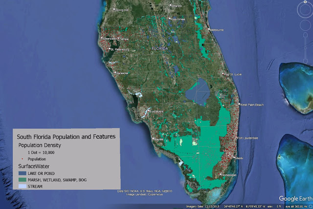
The initial task with the Lab was classifying a provided hydrology feature class and assigning appropriate symbology for water type. This data in turn was converted to a KML for use in Google Earth. Also supplied for the Lab was a Legend .png file and KML files for dot density for population and county boundaries.

All KML files were compiled in Google Earth, but the map legend required manual placement. This was accomplished using the Image Overlay tool, which utilizes a "GroundOverlay" to place an .jpg or .png file. Classmate Michael Lucas made an informative post on the class discussion board about instead creating a  a "ScreenOverlay". I was unsure how to accomplish this and opted to edit the XML of the KML file, changing <GroundOverlay> to <ScreenOverlay>. This was somewhat successful except for that the ScreenOverlay graphic was disproportionately large in context. I discarded it for the final output for Lab.

Screenshot of Google Earth Map covering South Florida hydrology and population density
The KML files and legend used for my Google Earth video tour of South Florida

With the legend in place, our next task was to create an array of bookmarks for various Florida metropolitan areas and city centers. The bookmarks were in turn used as part of a video tour, where Google Earth starts with an overview of southern Florida, and then proceeds to do fly throughs to the places bookmarked. 3D rendering of buildings in Downtowns were included as part of the tour.

Being that I am somewhat of a novice with the controls of Google Earth, I took the suggestion of using some of the keyboard shortcuts to navigate. Keyboard shortcuts are a must for online gaming, and hotkeys are also quite helpful with familiar software applications. However, usage of keyboard shortcuts requires substantial practice to be overall effective with it. As my video showed, I clearly have room for improvement.

The tour ultimately zoomed into the Miami metropolitan area and panned around Downtown Miami before moving north to Fort Lauderdale and then onto the Tampa Bay area. The video showed some choppiness where it appears I went back and forth with the navigation. This may be a drawback with graphics processing or the software, but those effects exaggerated some of my movements.

A visual aspect of the tour allows one to turn on and off layers as desired throughout the course of the video. Other options I explored included changing the speed at which Google Earth zooms in and out, and how responsive the navigation controls are. Clearly, more improvements can be made, but this goes hand and hand with experience.

My Google Earth files for Module 7 are uploaded to Google Drive:

Saturday, April 20, 2024

Isarithmic Mapping - Washington State Precipitation

The semester is accelerating and we move into the 6th lab covering Isarithmic Mapping! Following choropleth mapping, this thematic map type is the second most widely used in cartography. Isarithmic maps consider geographic phenomenon to be continuous and smooth, with measurements in the area of interest presumed to change gradually between data point locations instead of abruptly. There are two primary types of isarithmic mapping.

Often associated with meteorology, isometric maps depict smooth, continuous phenomenon, such as temperatures, rainfall, barometric pressure and wind velocity derived from data occurring at true points where values are actually measured at that location. The most common form of isometric maps are contour maps, which are lines marking equal value across a geographical area.

Collectively, contours used in isometric maps can be referred to as isolines. Iso in Latin means equal or the same. Variations of isoline terminology include isobars for lines of equal barometric pressure, isotherms for lines of equal temperature and isodrosotherms for lines of equal dew point.

Isopleth maps are comprised from data that occurs over geographic areas using conceptual points, where values are presumed to be at point locations. Isopleth maps show variations in quantity of features as a surface. The volume can be represented using contour lines or by filled contours with color shading representing quantitative values. Data for isopleth maps must be standardized to account for the area in which the data was collected.

Various interpolation methods on raster data sets are implored in the creation of isopleth maps. These methods generate data values over a given area using samples measured at control points. An algorithm in turn processes the data to predict the values of unknown points on an isopleth map. Values between the control points are predicted under the premise that spatially distributed objects are spatially correlated. Also referenced as the Concept of Spatial Auto Correlation, this basis of interpolation assumes that values of locations close together tend to share similar characteristics than those located farther apart.

The focus of lab this week is the creation of an isopleth map showing the average annual precipitation for a 30 year period across the state of Washington. The provided dataset was derived using PRISM, an inverse distance weight (IDW) interpolation method developed by the University of Oregon.

Washington Precipitation map using Hypsometric Tinting

The Parameter-elevation Regressions on Independent Slopes Model (PRISM) stresses elevation as the most important aspect in a localized region for the distribution of climate variables such as rainfall, temperature and dew point. The model calculates a climate-elevation relationship for each cell of a raster data set based upon data from nearby weather stations. The regression function used with the IDW method weights station data points to incorporate a wide range of physiographic variables that have a direct correlation with precipitation amounts and other climatological aspects.

Two types of isarthmic maps were created in Lab 6. The first was a continuous tone map, where geographic surfaces represent the values that exist across an entire area. Data collected at sample points, by mapping the density of points or the values they represent, factor into the interpolation that generates the continuous surface. This method portrays a more fluid appearance where data values in a raster set gradually transition from cell to cell.

The second was Hypsometric Tint, which reminds of me of the Futurama character the Hypnotoad, that classifies data into bands. These bands represent a method of coloring different values to enhance changes, such as in elevation with a Digital Elevation Model (DEM).

Using contours, hypsometric tint separates raster data into bands with uniform data values. These bands can represent a single value, or a range of values with lower and upper limits. An advantage of hypsometric tint is that changes in data are more clearly visualized over the smooth transitions of a continuous tone map. A drawback is that local variation of data values is lost with the generalization between contours.

The hypsometric tint map of Washington precipitation projected in State Plane coordinates.

Reprojecting the Washington precipitation data into State Plane coordinates, I ran through the lab again to create a second map showing Washington in a more aesthetically pleasing projection. This both gave me more practice with creating continuous tone and hypsometric tint maps, but also some of the difficulties with projecting data, as the hillside shading values changed from using world statistics to local statistics.

PRISM

PRISM was initially developed in 1991. Enhancements over time garnered the interest of the USDA Natural Resources Conservation Service (NRCS), which sought improvements for updated digital precipitation maps. With funding support, PRISM precipitation maps were generated for the Pacific Northwest and Intermountain West region of the U.S., where topographic features made mapping precipitation complex.

State Climatologists evaluated the maps produced by PRISM, offering their own suggestions for improvements. Following two years of trial and error, they concurred that PRISM produced maps equaling or exceeding previous ones produced by hand. The result is that the NRCS utilized PRISM to map averages for temperature and precipitation nationwide for the period from 1961 to 1990.

Sources:

Daly, C., & Bryant, K. (n.d.). The PRISM Climate and Weather System – An Introduction. University of Oregon. Retrieved April 20, 2024, from https://www.prism.oregonstate.edu/documents/PRISM_history_jun2013.pdf

The Hypnotoad may or may not approve of hypsometric tint!

via GIPHY

Monday, April 15, 2024

Hybrid Mapping - Choropleth and Graduated Symbols

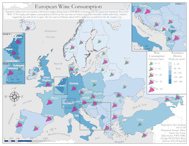
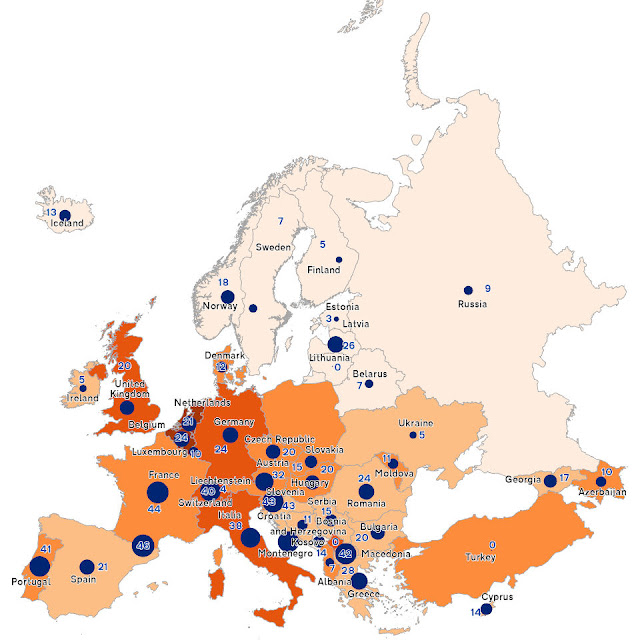
Map showing population density vs wine consumption for European countries

Module 5 for Computer Cartography advances our understanding and usage of choropleth maps while introducing us to proportional and graduated symbol map types.

A choropleth map can be described as a statistical thematic map showing differences in quantitative area data (enumeration units) using color shading or patterns. Choropleth maps are not to be used to map totals, such as ones based on unequal sized areas or unequal sized populations. Instead data should be normalized using ratios, percentages or another comparison measure.

Proportional symbol maps show quantitative differences between mapped features. This is the appropriate map type designed for totals. The map type shows differences on an interval or ratio scale of measurement for numerical data. Symbols are scaled based upon the actual data value (magnitude) occurring at point locations instead of a classification or grouping.

Graduated symbol maps also show quantitative differences in data, but with features grouped into classes of similar values. Differences between features use an interval or ratio scale of measurement. The data classifications use a scheme that reflects the data distribution similar to a choropleth map. Previously discussed data classification methods, such as Equal Interval and Quantile, can be applied to generate classes.

Our lab for Module 5 was the creation of a map dually showing the population density of people per square kilometer and wine consumption at the rate of liter per capita for countries in Europe. A dual choropleth map will display population densities for the continent while a graduated or proportional symbol map will quantify wine consumption rates for each country.

The lab exercise tasks included the creation of both a proportional symbol map and a graduated symbol map of Europe. The ultimate map type used to portray the country data is partly based upon the anticipated ease of a map user to visually interpret the maps.

Generating a proportional map in ArcGIS Pro is a more rigid process with less user options. The scale classifications are preset to five breaks partitioning data into ranges of 20%. However, the feature class labels are not clearly understood, as the range array is 1, 2.5, 5, 7.5 and 10. The minimum size of the symbol proportionally determines the maximum value.

The raw and mostly unstylized output of the Proportional Symbol Map, with arbitrary values showing the rank of counties in wine consumption from lowest to highest, while the sizes convey the actual wine consumption rate of liters per capita:

Proportion Symbol Map of Europe

A graduated symbol map for this assignment provided more flexibility with various methods of classification, more easily understood class separations and automatically generated labels, the ability to adjust classes using Manual Breaks, and absolute control over setting symbol sizes. The final output:

Map showing population density vs wine consumption for European countries

An added aspect of this lab was the introduction of picture symbols, which can be used in place of the default ArcGIS symbol set. Picture symbols allow for more personalized customization to a map, as long as they appropriately distinguish between differences of data magnitude.

Using a blue color palette from the Color Brewer web site, used the Natural Breaks data classification method to generate the choropleth map of European countries by population. The graduated symbol element of the map uses picture symbols that I created in Adobe Illustrator based off the Winery sign specifications used on Florida roads.

Picture Symbols Created for the European Wine Map

The winery icons incorporate a color scheme to aid in visually distinguishing the differences in data magnitude. The highest wine consumption rate equates to the largest symbol size where all grapes in the graphic are colored magenta. The next tier down in order reduces the symbol size by 15% and the proportion of graphics colored magenta versus those shaded green.

A series of three insets were created to better show detail on some of the smaller countries or groups of countries. These required some data exclusion so as not to conflict with data on the main map frame. Prior to creating the insets, I used the Polygon to Point geoprocessing tool to generate a separate point feature class for the graduated symbols. This provided me with the flexibility to relocate the placement of symbols in addition to the option of moving annotated text for the final layout.

The inset creation utilized a definition query with the SQL expression "not including values(s)", where wine consumption data for countries not to be displayed were omitted from the respective inset dataset. The annotation layer for the main map frame was also replicated for each inset to reduce conflict and speed up labeling time.

Chose Garamond font to give a more elegant look to the final map, since the wine is often equated with fine dining or culture. Additionally the blue color palette was specifically selected so as not to contrast with the color of the winery symbols.

Tuesday, April 2, 2024

Cartographic Design - Gestalt Principles of Perceptual Organization

Module 3 for Computer Cartography builds on Module 2, where we started developing a routine for good map design with guidelines for labeling, annotation and layout text. Building upon that knowledge base, we focus on cartographic design, the method with which maps are conceived and created. The Gestalt Principles of perceptual organization factor into the design process for the Module 3 lab assignment.

There are several key concepts integral to the cartographic design process. Good design should meet the needs of map users and develop maps that are easy to interpret. Maps should be accurate and present data without distortion. Data should be legible and aesthetically pleasing, using either communicative or thought provoking symbols, color, layout and typographic appearance.

The design process focuses on how the data will be reproduced or disseminated. This initial factor helps determine the color scheme, map scale and the file format considered for potential printing methods. Next to strategize is how to classify the data and what symbolization to use. Ranking map elements, emphasizing what is most important and reducing the visual impact of the more irrelevant information contribute to the intellectual hierarchy of the map. The design process is repeated until the map is completed.

Friday, March 15, 2024

Cartography, the Good and the Bad

Advancing to our second week of Computer Cartography, the first module requires us to think about how we look at and interpret a map. Our task was to select for critical analysis and evaluation, both a map that we consider well designed, and another that is poorly designed.

What a task that was, as there have been several over the years that fit both contexts. Trying to recall any that stood out proved to be challenging, because as the saying goes "out of sight, out of mind." Fortunately I have a growing repository of map documents that I use for researching page creation and updates for AARoads. Sifting through the various folders, I found two that fit the criteria.

Well Designed Construction Project Map

The well designed map selected is the most recent Overview Map of the ongoing PA Turnpike/I-95 Interchange Project in Bucks County, Pennsylvania. Within lecture, we were introduced to the map design principles of the British Cartographic Society's Design Group. One that stood out for me is "Simplicity from Sacrifice" where great design tends toward simplicity or more simply "less is more."

The PA Turnpike/I-95 project map colorizes only the affected roads within the project area. Having a full color map of the entire area is not necessary in this context, so reducing the detail and keeping the design focused solely on the subject is appropriate for this type of map. The map audience can clearly view the project and the simple color scheme conveys what is currently under construction, and what to expect in the future.

Many of the maps I have been tasked with creating or updating were all-inclusive. Street atlases for Mapsource, Wall Maps for Universal Map Group, products that included an array of points of interest, every public road, detailed hydrology features, etc. Designing a map with less correlated to producing an incomplete product or omitting features out of laziness. This philosophy was engrained into my cartographic style and I did not question it until this module...

The second principle of the British Cartographic Society's Design Group discussed in lecture is "Hierarchy with Harmony." The concept is to emphasize what is important on a map, to reduce the less important and remove the unimportant. The PA Turnpike/I-95 project map conveys only the necessary information, with a substantial amount of street level detail reduced in prominence. Not all roads were deemphasized to the same level, as intersecting highways to the project area were made to stand out somewhat against the rest of the area.

So less is more works out well in this context. Viewers do not need to see unaffected roads and areas with the same level of detail or colors as the map's primary focus. Yet keeping some of the detail in the background still conveys the population density of the area, showing that the project will have impacts to the nearby communities.

Poorly Designed GIS Map of Salt Lake City
This Salt Lake City Community Councils and Neighborhoods Map immediately stood out as a poorly designed map candidate. It nearly looks like raw, unstylized GIS data, yet some effort was placed in the layout and output to consider it fit for use by the public.

The first map design principle of the British Cartographic Society's Design Group is "Concept before compilation." This stresses that it is important to understand the concept of your map entirely. What does the map need to contain, how should it look, who is the intended audience and what will they want or get from the map?

I originally downloaded this map of Salt Lake City to learn what were the neighborhoods in the city and what were their general boundaries. The map conveys this, but not in an efficient or appealing manor. The amount of black linework from the street rights of way overwhelms the map, making it hard to parse neighborhoods from community council districts. The background results in just noise, and without any emphasis on major streets or legible street names, another map has to be consulted to formally locate a neighborhood within the street grid.

The thick neighborhood polygons dominate the feel of this map. Lost within their bounds is the small red italicized text referencing the neighborhood names. The way it is presented, the neighborhoods and community councils appear synonymous with one another, but that is not apparent until analyzing an area of the map with less detail. Clearly this map does not adhere to the Hierachy with Harmony map design principle.

It is arguable what may be more important in this Salt Lake City map, neighborhood boundaries or community council areas? Without any descriptive text somewhere on the map telling the audience what the community councils are, or what is their purpose, their significance is unclear. Is the label size appropriate for those councils? This map conveys that they are important, yet the boundaries of the neighborhoods hold just as much weight in their line thickness. So the hierarchy is not readily known for the end map user, another poor design aspect of this map.

Another topic stressed in this week's module are map elements (title, legend north arrow, scale bar, etc.) and more specifically the placement of them. Utilizing areas of white space for elements is one thing, but also leaving room for them in the map layout is another. All the while balancing map elements with the overall composition of the map is important. An aesthetically pleasing layout goes a long way.

Friday, October 27, 2023

Land Use/Land Cover (LULC) Identification for Pascagoula, MS

The second module for GIS4035 Remote Sensing/Photo Interpretation introduces the USGS Land Use/Land Cover (LULC) classification system. Originally compiled by James R. Anderson and associates, A Land Use and Land Cover Classification System for Use with Remote Sensor Data was published by the United States Government Printing Office in 1976. There are four levels in the hierarchy, with Level I categorizing LULC on air photos with small scale and low spatial resolution. As Levels increase, so does the detail, corresponding with increases in spatial and spectral resolution and larger scale.

With additional increases in resolution and scale, LULC Level III further distinguishes features from the broader categories. This can be correlated to analyzing data at the city level as opposed to countywide. The numerical system of LULC Classification starts with the first number of code. The small scale categories for Level I are as follows:

  1. Urban or Built-up Land
  2. Agricultural Land
  3. Rangeland
  4. Forest Land
  5. Water
  6. Wetland
  7. Barren Land
  8. Tundra
  9. Perennial Snow or Ice
Representing a subcategory of Level I, Level II utilizes a second digit. For Urban or Built-up Land, 11 represents Residential areas, 12 Commercial and Services, 13 for Industrial areas, etc. Level III expounds classifications in Level II into more distinct categories. So for LULC 11 for Residential, LULC 111 is Single-family units (single family homes), 112 is Multi-family Units (duplexes, townhomes), 113 is Apartment Buildings.

Generally code information for Level I and II is readily available on the internet, starting with the 1976 Anderson Classification System document. The Modified Anderson LULC Classification used for the USGS National Land Cover Dataset however changes some of the verbiage used in the Level I and Level II classes while introducing an additional code set. This results in some confusion, as determining the final LULC codes, especially for Level III and especially Level IV becomes more tedious.

LULC Classification Codes for Level IV can vary, with some states setting their own code structure. Researching codes for Level III and Level IV revealed some of the differences between sets use for Florida, New Jersey and Oregon. Ultimately it appeared that the New Jersey classification scheme seemed to provide the most detailed Level IV data, which provides codes for discrete land types such as cemeteries or athletic fields for schools, areas that may be visually identified at the city level of an air photo.

The lab for this week visually interprets an air photo of western reaches of Moss Point and Pascagoula along the East Pascagoula River in the Mississippi Gulf Coast. The resolution of the air photo was 16 square feet based upon the Stateplane coordinate system used. Based upon this the scale was set at 1:5,000. However after a good discussion during virtual office hours, the Minimum Mapping Unit (MMU) should have been 2 to 4 times greater than the 16 square foot cell size.

With the MMU selected, consistency should be followed. Since I had already analyzed 100% of the map by the time MMU was better explained, I opted to leave the Level III and IV classification polygons I derived from the larger scale.

Part of my analysis with more detail comes from years of studying aerial photography as a map researcher for Mapsource, Universal Map and AARoads. So it was acknowledged that skill sets for air photo interpretation can vary from individual to individual, and that my level of detail was still acceptable for this project.

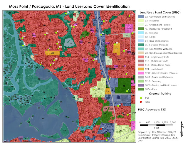
LULC Classification and Ground-Truthing an Air Photo

With the LULC analysis complete, the next task was ground-truthing collection. Since the area of Jackson County, MS is not readily accessible for the class, imagery from Google Maps Street View (GMSV) and other sources of high-resolution aerial photography supplants the in-situ data collection.

Cross referencing the air photo with the historical imagery slider on Google Earth revealed that the photography was conducted in February 2007. This provided the temporal resolution for the ground-truthing exercise. GMSV went online in 2007, and the bulk of the coverage in Moss Point and Pascagoula dates back to 2008.

The majority of the sampling locations corresponded to readily accessible GMSV imagery. There were a few exceptions where some further interpretation was necessary. As for the sampling selection, bias was introduced due to the fact that around one third of the air photo covers areas of open waters or wetland areas outside of the GMSV range. So the extent used for the "create random points tool" in ArcGIS Pro focused on areas mostly inland. A tolerance was set at 16 feet, to provide a minimum distance between sampling locations.

Attempting to use the error matrix discussed in lecture, the LULC accuracy for the 30 points sampled was 93%. The goal of the exercise was general land use and land cover, and my selection of some discrete land use such as schools and churches, added some error potential to the overall accuracy forumlae.


Friday, October 13, 2023

Bobwhite Manatee Transmission Line Analysis - Final Project

The final project for GIS4043/Intro to GIS conducts analysis on the Bobwhite Manatee Transmission Project in Southwest Florida. Part of the Florida Power & Light (FPL) infrastructure, the 24.5 mile long transmission corridor was developed to serve growing areas of eastern Manatee and Sarasota Counties, including Lakewood Ranch. Additionally the new line offers redundancy during hurricanes, something tested since it was completed with Hurricane Irma in 2017 and Hurricane Ian in 2022.

GIS analysis was used in part to determine the optimal location for the proposed transmission corridor. The design of the route took considerations for reducing impacts on sensitive or protected conservation land, avoiding schools and daycares, and providing a buffer from existing homes. Community input factored heavily with the corridor ultimately selected. FPL also worked with Schroeder-Manatee Ranch (SMR), the developer of the Lakewood Ranch community, to select a route that preserves the natural beauty of the area.

The study area was 273 square miles wide, mostly spread across central Manatee County along with a portion of northern Sarasota County. The project was announced by FPL in June 2006. With input from a community advisory panel, open house events and surveys mailed to area residents, FPL developed formal plans, which were unveiled in October 2006.

The Bobwhite Manatee Transmission Line project was eventually certified by the Florida Department of Environmental Protection. It subsequently cleared the Transmission Line Siting Act and was approved by the Florida Cabinet and Governor on October 28, 2008. Construction was anticipated to begin in 2010. It ultimately did in 2013, following additional compromises made between FPL, SMR, area homeowners and Taylor & Fulton, an area agricultural group.

Our project looks at four criteria analyzed by GIS for the selection of a preferred corridor for the transmission line. The first objective considered the number of homes and overall properties within proximity of the corridor.

Using the buffer geoprocessing tool, a 400-foot buffer was created around the preferred corridor of the planned transmission line. A feature class locating all homes within the corridor and associated buffer was next created with heads-up digitizing using 2006 aerial photography. With all visible homes added to GIS, running the "select by attribute" geoprocessing tool on created fields that indicated if a home was either within the corridor or within the 400-foot buffer, provided the totals. A map output of the homes and parcels intersecting the corridor:


The transmission line that was eventually built comes no closer to 600 feet from an existing home. No doubt GIS aided in achieving this buffer.

The second objective of GIS with the Bobwhite Manatee Transmission Line project was a simple one. Are their any schools or daycare centers within the preferred corridor, or the associated 400-foot buffer? Some work outside GIS was required to analyze this, as point feature classes for schools and daycares did not exist.

Researching area schools with the Department of Education website, and other websites for daycares falling within zip codes that crossed the preferred corridor, lists were compiled in Excel. These were in turn geocoded into GIS, using more recent street centerline files to complete address matching for automating the location process.

With school layers compiled, the select by attributes geoprocessing tool determined that no schools or daycare centers were within the preferred corridor or buffer:

That fact that FPL avoided all schools and daycares certainly reduced community opposition to the overall project.

Moving on with the analysis, environmental impacts to both conservation areas and wetlands was considered. National Wetlands Inventory (NWI) and Florida Managed Lands data were provided. The question to be answered is how many acres of each land type was within the preferred corridor?

For wetlands, the NWI feature class was clipped within the preferred corridor polygon. The result were records for uplands and two wetland types, with the Shape Area field providing the areas in square meters. After converting the values into acres, calculating the total acres of uplands and wetlands was easily achieved using the Summary Statistics geoprocessing tool.

Conducting spatial analysis on the conservation areas, a different approach was taken using the Select by Location geoprocessing tool with the Intersect relationship. This extracted all polygons in the conservation land feature class that were within the preferred corridor into a new feature class. The resulting data revealed that relatively small portions of a conservation easement, watershed and state park were in the preferred corridor:


The final objective analyzed by GIS was to estimate the total length of the then-future transmission line, and to use that figure in an equation to estimate construction costs. This was a straightforward process using the Polygon to Centerline geoprocessing tool.

However one data discrepancy occurred with the creation of the centerline feature class. The centerline split into separate branches within the triangular shaped wedge at the south end of the preferred corridor. I considered these to be outliers when it came to the determining the overall length of the transmission line.

One option was to take an average of the length between the two and consider adding that to the main centerline vector. Another option was to omit them entirely, as the project included constructing the Bobwhite Substation within that wedge shaped area.

GIS analysis determined an estimated total length of 24.76 miles. An East County Observer news article on the Bobwhite Manatee Transmission Line in 2013 referenced the line being built at the time as 24.5 miles in length. So this was a pretty good result from GIS.

Living in Bradenton from June 2013 to April 2015, I drove by this project several times without knowing much about it. While doing photography for AARoads, I captured work in progress along State Road 64. Looking back at the photos, what was built was a 230kV single circuit transmission line on a steel tubular pole. Using the equation provided with the GIS project documents, that resulted in a rate of $1.1 million per mile. The $27.236 million I calculated was well above the $20 million cost reported in the East County Observer article.

In conclusion, it appears that FPL designed the Bobwhite Manatee Transmission Line with a priority in the feedback from the community. The route was designed to follow existing right of way for several major highways. Using that space instead of a new corridor, the impacts to protected lands was minimized. Beside one home that was eventually demolished to make way for the Bobwhite Substation, it appears as if most existing homes were avoided by the power line.

Wrapping things up, beyond the deliverables posted above, we were tasked with creating a Power Point Slide Show presentation and accompanying transcript. Both are uploaded to my Google Drive: