Showing posts with label gis4035. Show all posts

Tuesday, November 21, 2023

Supervised Image Classification - Germantown, Maryland

The fifth module for Remote Sensing and Photo Interpretation introduced Supervised and Unsupervised Digital Image Classification techniques. These are automated processes for converting a spectral class, a group or cluster of spectrally similar pixels, into an information class, i.e. land use/land cover class of interest.

Using multi-spectral data and spectral pattern recognition techniques, the algorithm may take many spectral classes to describe a single information class. Similarly one spectral class may represent more than one information class.

Unsupervised classification uses a form of clustering algorithm to determine what land cover type each pixel most matches. The tendency of spectral data is that pixels of one land cover class tend to cluster together. Within the Lab using ERDAS Imagine, I inputted a high resolution aerial photograph of the UWF campus and used Unsupervised Classification processing with the number of classes set to 50. Maximum Iterations and Convergence Threshold were set to prevent the program from running an infinite loop, and with a threshold resulting in a 95% level of confidence for the classification of pixels.

Eventually through reclassification, the 50 classes generated from ERDAS were pared down to just five. Using visual interpretation techniques, pixels were identified and assigned into classes for trees, grass, buildings/road, shadows and a mixed classification group. The mixed classification included pixels associated with more than one type of land use/land cover.
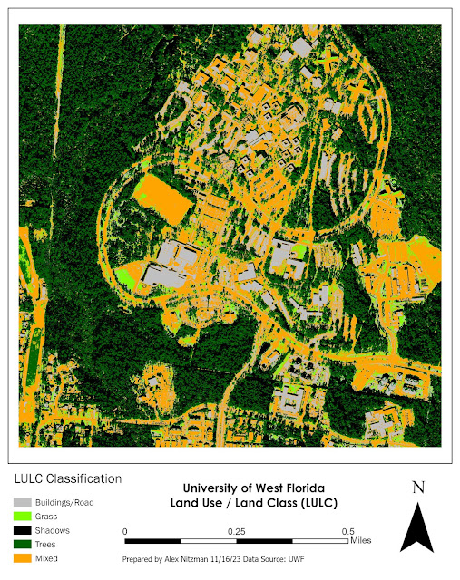
LULC Map of UWF using Unsupervised Image Classification
The final output after reclassifying the 50 spectral classes into five

Supervised image classification uses one of two approaches. The first is Signature Collection, where an analyst uses prior knowledge and visual techniques to identify different types of LULC to establish training sites. The second grows a polygon from a Seed pixel, where an algorithm develops training sites which tries to decrease n-class variability (N being the variable number of bands) such as by setting variance, total number of pixels and values of adjacent pixels. This is similar to the Magic Wand tool in Photoshop, which selects similar pixels across a selected area.

The supplied imagery was from Landsat TM4 of Germantown, Maryland with a low spatial resolution. The image was likely from the late 1980s or between 1990 and 1992 based upon visible construction to the south expanding Interstate 270 to four roadways.

The lab instructions provided LULC classifications for 12 preselected sites based upon their coordinates. As an analyst, I was tasked to create an AOI (Area of Interest) polygon representative of all pixels falling within the LULC specified. This proved to be quite tedious, as the spectral class of several pixels represented multiple information classes.

The AOI polygons were used to create a Spectral Signature file that ERDAS Imagine applies to an automated process for classifying all pixels within the imagery. AOI areas included urban/residential, grasses, two forest types, fallow fields and agricultural areas. Upon completion of populating the signature file, the imagery was reclassified using the Parametric Distance Approach and Maximum Likelihood classification method.

The first attempt resulted in over 10,000 acres of the imagery classified as urban/residential. Comparing the imagery with aerial photography of Germantown, MD from 1993 on Google Earth, this was clearly over exaggerated. The recoding process resulted in many agricultural tracts being misclassified as urban.
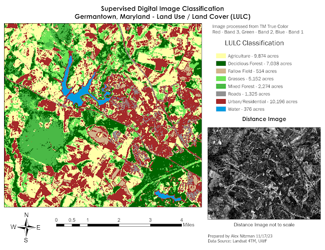
1st Attempt at Supervised Digital Image Classification for Germantown, MD
First attempt at supervised image classification for Germantown, MD LULC

Opting to start over on the AOI creation, I narrowed down my pixel areas for most of the preselected training sites. Recoding it resulted in large areas of fallow fields in place of agriculture. Returning to the signature file created, I added several new training sites based upon the distance image and visual interpretation. These mostly focused on better identifying agricultural areas.

The result was a more accurate classification of the imagery when it came to both urban/residential and agriculture. While there were still areas of farm land misclassified as urban, the percentage was vastly lower than my previous attempts.
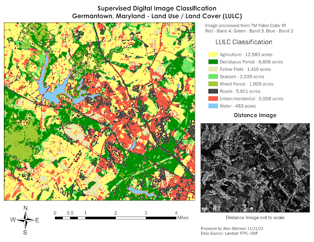
Supervised Digital Image Classification of Land Use / Land Cover
Final output of Germantown, MD LULC using Supervised Image Classification


Sunday, November 12, 2023

Multispectral Data Analysis - Olympic Pensinula, Washington

This week's Remote Sensing and Photo Interpretation lectures and lab assignment introduced a myriad of information related to image preprocessing. Functionality and various atmospheric correction techniques were discussed, followed by in depth look at several vegetation indices. The textbook provided great detail of the spectral characteristics of vegetation, including how visible light interacts with tree leaves and canopies.

The lab introduced data acquisition and the USGS Global Visualization Viewer (GloVis). There are a great many options with the web site, and we only scratched the surface with a single download of Landsat 4-5 TM data for the Pensacola area from 2011.

Next was an overview of Spatial Enhancement of raster data and a number of filters. Among other tasks, filters such as Fourier transform can be used to repair data such as with banding while convolution filtering can generalize data and sharpen data. Histograms can be utilized to omit unneeded data from analysis.

Working in ERDAS Imagine, I implemented a low pass filter on panchromatic imagery. This smooths out an image and is similar to the blur filter in Photoshop. It consolidates pixels within a 3x3, 5x5 or other kernal into an average, so local variation is reduced and "noise" removed. More specifically it takes the average digital number (DN) value of all cells within the kernal, and applies it the central kernal.

Unedited Panchromatic Imagery - Band 8 with wavelengths of 0.52-0.90 micrometers

So some of the smaller details found across the rows and columns of pixels are reduced or eliminated while effects on larger scale features are minimal. When viewing imagery more broadly, this can aid in interpreting large-scale patterns. It also can correct for erroneous pixels, such as a stuck pixel in digital photography, where bad data or missing data may have occurred with the initial image generation.

Low Pass Filter image processing on Panchromatic Imagery

Shifting to high pass filter on the same panchromatic imagery, this function accents features with edges while also enhancing linear features. It accentuates differences between one cell's DN and its neighboring cells. High levels of change for DN values from rows and columns of the imagery become more apparent.

High Pass Filter image processing on Panchromatic Imagery

Also referred to as edge-enhancement, the high pass filter highlights boundaries between features, such as the edge of a forest stand by farmland or a shoreline. Sharpening the edges between objects aids in seeing small scale differences while reducing broad scale patterns. I equated this with the sharpen tool in Photoshop.

Convolution Filter with kernals of 3x3 Sharpen

Within ArcGIS Pro, I used the Focal Statistics tool. Similar to Block Statistics, which calculates a new single cell value for every cell within a kernal, Focal Statistics calculates new values for every cell in the raster imagery.

There are several Statistic type options within the Focal Statistics geoprocessing tool. Using the Mean statistic type, the larger kernal resulted in each new cell value being the average of the larger area, resulting in a more generalized image.

ArcGIS Pro Geoprocessing tool Focal Statistics with a 7x7 kernal and Mean as the filter

The Range statistic type, commonly referred to as Edge Detect, generates a new call value that reflects the difference or Spatial Frequency in DN values between adjacent cells. High DN values are assigned for pixels with high spatial frequencies, where the maximum value in the kernal is subtracted by the minimum value in the kernal. This tool can be used to reveal edges or borders between different types of features.

ArcGIS Pro Geoprocessing tool Focal Statistics with a 3x3 kernal and Range as the filter

The last image preprocessing tool used this week was Image Histograms. The Histogram is a statistical graph comprising the total range of DN values, with spikes referencing high amounts of pixels (areas in the raster) that are outliers as compared to the homogeneous ranges for the bulk of the remaining pixels. The spikes can represent areas within the overall imagery where brightness values are very dark or very light as compared to the rest.

Adjusting the Radiometry in ERDAS Imagine using the Histogram breakpoints allows us to exclude pixel ranges outside of them from the imagery. This narrows down the brightness scale, with dark areas to the left and right areas to the right of the overall Histogram. Performing this operation can enhance the visualization of data.

When we adjust Levels in Photoshop, the Histogram is part of that filter. When a photo is visually too dark or blown out with light, adjusting the Levels can drop those extreme DN's from the visual presentation, improving the look. Having edited photos for 23 years on AARoads, I know better understand how this filter works!

Photo before preprocessing, large DN range beyond the histogram spike
Processing the photo with the Levels filter using histogram, break points DN's adjusted to 8 and 211

The following maps covering the Olympic Peninsula in Washington State from Seattle west to the Olympic Mountains. The lab tasks involved identifying features based upon three separate radiometric criteria. The data was from the Landsat 5 Thematic Mapper (TM) satellite, a multispectral sensor assigning the first seen spectral bands to the following spectral regions with wavelength frequencies in micrometers:

Band 1 / Blue visible light - 0.45-0.52

Band 2 / Green visible light - 0.52-0.60

Band 3 / Red visible light 0.63-0.69

Band 4 / Near Infrared (NIR) 0.76-0.90

Band 5 / Shortwave Infrared (SWIR) 1 - 1.55-1.75

Band 6 / Thermal 10.40-12.50

Band 7 / Shortwave Infrared (SWIR) 2 - 2.08-2.35

Once a feature is identified, the lab specified using the Create Subset tool to extract a corresponding area. Bringing the subset into ArcGIS Pro, colors for the spectral bands were assigned to enhance the visualization of the features to be identified.

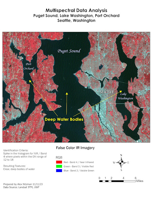
The first map produced shows Seattle and areas of deep, clear water with low DN values. Using False Color IR imagery, where red is assigned to Near Infrared (NIR), the darker pixels with Puget Sound, Lake Washington and Port Orchard are easily distinguishable.

False Color TM Map showing low DM values with deep, clear water
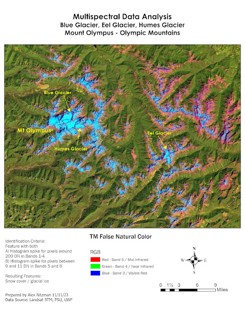
The criteria for the second feature to identify focused on the histogram of the Landsat 5TM image where a spike in Bands 1-4 corresponded with pixels around a DM value of 200. Additionally the criteria also called for areas where the histogram for Bands 5 and 6 spiked between DM values of 9 and 11. This referenced areas of snow and glacial ice high in the Olympic Mountains.

Went with a False Natural Color map for the data where it clearly shows snow/ice as light blue, a result of the high radiant reflectance of red, green and blue visible light, which is visibly as the color white. Areas adjacent to the glaciers and snow pack reflect the Mid-Infrared and the NIR shows the abundant forest cover on the mountains.
TM False Natural Color of Mount Olympus in Washington

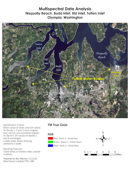
Last to identify for Lab 4 were areas of water where visible light (bands 1-3) were brighter than normal. NIR reflectance is also slightly higher, but DM values of bands 5-6 remained unchanged. EMR penetrates deeper in clear water, resulting in higher absorption rates and low reflectance. Within shallower and turbid water, the presence of sediment and other particles in the water causes more EMR to reflect, giving the brighter appearance.

Within the Puget Sound area, brighter surface water is associated with mud flats or where streams dump into the larger bays.
TM True Color Image of Nisqually Reach in Washington


Friday, November 3, 2023

Introduction to ERDAS Image - Washington Forest Thematic Data

The third lab assignment for Remote Sensing/Photo Interpretation introduces ERDAS (Earth Resources Data Analysis System) Image. The first part of the lab provided a basic overview of the program, initially with some rudimentary tasks involving Advanced Very High Resolution Radiometer (AVHRR) imagery and a LANDSAT Thematic Mapper (TM) satellite image of forestland in Washington State.

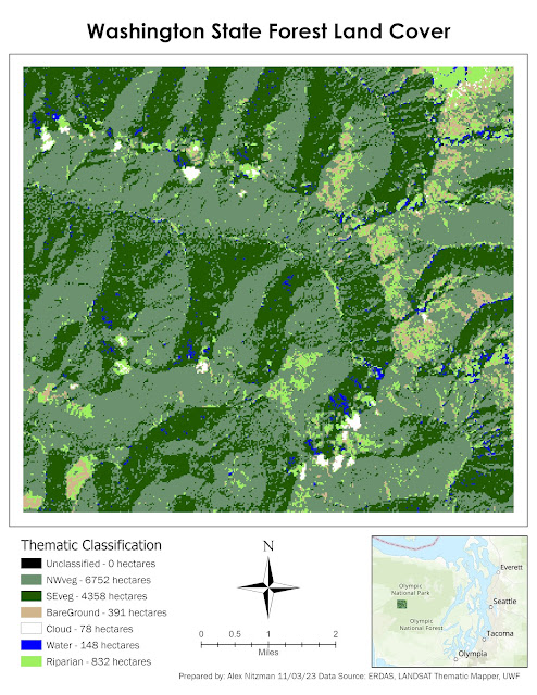
Working with the data from the Olympic Peninsula in Washington, learned how to add an area column to the attributes table that calculates the area in hectares for each land classification. Focusing on a smaller area within the overall imagery, then used the Inquire option to extract a subset image for closer analysis. Next needed to recalculate the area for the subset image prior to outputting the file for ArcGIS Pro.

Within ArcGIS Pro, symbolized the subset image and then created a final layout showing the thematic classification with area size statistics:

Thematic subset from ERDAS Imagine of land cover in Washington State


Friday, October 27, 2023

Land Use/Land Cover (LULC) Identification for Pascagoula, MS

The second module for GIS4035 Remote Sensing/Photo Interpretation introduces the USGS Land Use/Land Cover (LULC) classification system. Originally compiled by James R. Anderson and associates, A Land Use and Land Cover Classification System for Use with Remote Sensor Data was published by the United States Government Printing Office in 1976. There are four levels in the hierarchy, with Level I categorizing LULC on air photos with small scale and low spatial resolution. As Levels increase, so does the detail, corresponding with increases in spatial and spectral resolution and larger scale.

With additional increases in resolution and scale, LULC Level III further distinguishes features from the broader categories. This can be correlated to analyzing data at the city level as opposed to countywide. The numerical system of LULC Classification starts with the first number of code. The small scale categories for Level I are as follows:

  1. Urban or Built-up Land
  2. Agricultural Land
  3. Rangeland
  4. Forest Land
  5. Water
  6. Wetland
  7. Barren Land
  8. Tundra
  9. Perennial Snow or Ice
Representing a subcategory of Level I, Level II utilizes a second digit. For Urban or Built-up Land, 11 represents Residential areas, 12 Commercial and Services, 13 for Industrial areas, etc. Level III expounds classifications in Level II into more distinct categories. So for LULC 11 for Residential, LULC 111 is Single-family units (single family homes), 112 is Multi-family Units (duplexes, townhomes), 113 is Apartment Buildings.

Generally code information for Level I and II is readily available on the internet, starting with the 1976 Anderson Classification System document. The Modified Anderson LULC Classification used for the USGS National Land Cover Dataset however changes some of the verbiage used in the Level I and Level II classes while introducing an additional code set. This results in some confusion, as determining the final LULC codes, especially for Level III and especially Level IV becomes more tedious.

LULC Classification Codes for Level IV can vary, with some states setting their own code structure. Researching codes for Level III and Level IV revealed some of the differences between sets use for Florida, New Jersey and Oregon. Ultimately it appeared that the New Jersey classification scheme seemed to provide the most detailed Level IV data, which provides codes for discrete land types such as cemeteries or athletic fields for schools, areas that may be visually identified at the city level of an air photo.

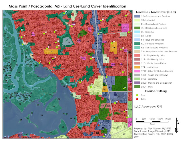
The lab for this week visually interprets an air photo of western reaches of Moss Point and Pascagoula along the East Pascagoula River in the Mississippi Gulf Coast. The resolution of the air photo was 16 square feet based upon the Stateplane coordinate system used. Based upon this the scale was set at 1:5,000. However after a good discussion during virtual office hours, the Minimum Mapping Unit (MMU) should have been 2 to 4 times greater than the 16 square foot cell size.

With the MMU selected, consistency should be followed. Since I had already analyzed 100% of the map by the time MMU was better explained, I opted to leave the Level III and IV classification polygons I derived from the larger scale.

Part of my analysis with more detail comes from years of studying aerial photography as a map researcher for Mapsource, Universal Map and AARoads. So it was acknowledged that skill sets for air photo interpretation can vary from individual to individual, and that my level of detail was still acceptable for this project.

LULC Classification and Ground-Truthing an Air Photo

With the LULC analysis complete, the next task was ground-truthing collection. Since the area of Jackson County, MS is not readily accessible for the class, imagery from Google Maps Street View (GMSV) and other sources of high-resolution aerial photography supplants the in-situ data collection.

Cross referencing the air photo with the historical imagery slider on Google Earth revealed that the photography was conducted in February 2007. This provided the temporal resolution for the ground-truthing exercise. GMSV went online in 2007, and the bulk of the coverage in Moss Point and Pascagoula dates back to 2008.

The majority of the sampling locations corresponded to readily accessible GMSV imagery. There were a few exceptions where some further interpretation was necessary. As for the sampling selection, bias was introduced due to the fact that around one third of the air photo covers areas of open waters or wetland areas outside of the GMSV range. So the extent used for the "create random points tool" in ArcGIS Pro focused on areas mostly inland. A tolerance was set at 16 feet, to provide a minimum distance between sampling locations.

Attempting to use the error matrix discussed in lecture, the LULC accuracy for the 30 points sampled was 93%. The goal of the exercise was general land use and land cover, and my selection of some discrete land use such as schools and churches, added some error potential to the overall accuracy forumlae.


Sunday, October 22, 2023

Remote Sensing - Visual Image Interpretation Basics

A short two days following the completion of the Final Project for GIS4043, I am delving into Photo Interpretation and Remote Sensing (GIS4035). The first lab provides an overview on elements of visual image interpretation, with historical black and white air photos of Pensacola Airport and Pensacola Beach in Northwest Florida.

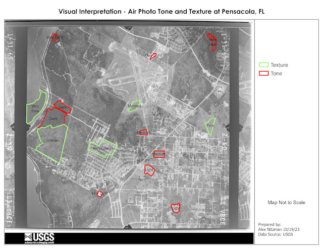
The first aspect of aerial photography interpretation references the tone, or the shades of gray from light/white to dark/black. Referencing the course textbook Remote Sensing of the Environment - An Earth Resource Perspective, tone is a function of the amount of light reflected. Consequently, the greater the absorption of the incident red light by forest stands results in a darker tone.

Large grassy areas, such as those within the Pensacola Airport grounds or for the runway safety areas, appear on the aerial below with a lighter tones. The soil in Escambia County is very sandy, and sand appears in a light tone. Areas by the airport where grading appeared to be underway at the time appear with a very light tone.

Tone and Texture Polygons on a B/W Air Photo
Texture is defined in the course textbook as the characteristic placement and arrangement of repetitions of tone or color in an image. With aerial photography, texture aids in identifying land areas populated by similar groups of objects. The definitions of texture range from fine/smooth, where an area is uniform or homogeneous, to intermediate/mottled, and rough/coarse where the contents of an area are heterogeneous.

Some of the examples identified in the Pensacola aerial included fine areas of smooth surface water in Escambia Bay and swatches of flat grassland. Texture increases with variation on the ground cover, such as areas within Pensacola Airport, to coarse areas of timber land located toward the bay front. The roughest areas of texture include subdivisions with the mixture of house footprints and tree canopies.

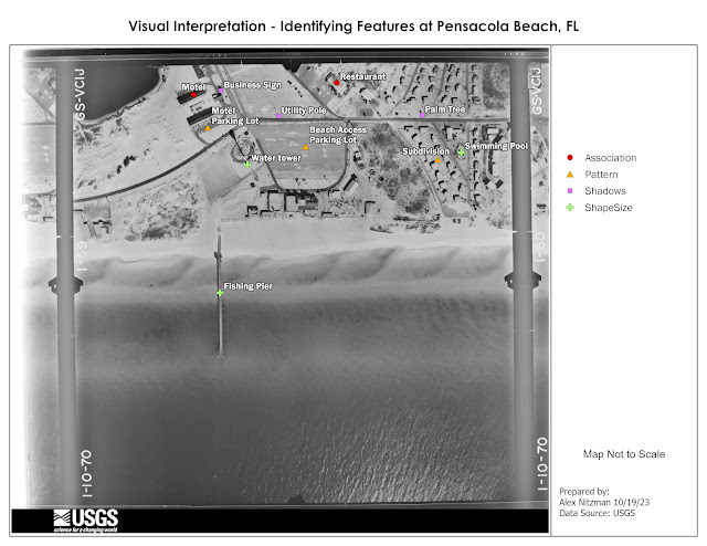
Next to consider when it comes to identifying features on an air photo are aspects of shape, size, pattern, shadows and association. Shape can be a dead give away in some instances, such as the Pensacola Beach fishing pier (one long since replaced due to hurricanes), with its linear appearance on the following aerial.

Identification by Size, Shape, Pattern, Shadow and Association
Shadows often provide insight into what an object may be, such as the Pensacola Beach Water Tower. Looking closer, smaller objects are indefinable based upon their shadow, such as palm trees because of the distinct shape of their fronds.

Like many things in life, appearances on the ground often result in a pattern, or a series of patterns. Striping for a parking lot creates a pattern of linear or angled spaces. A subdivision usually has some uniformity in the placement of houses and their orientation to each street.

Depending upon the area and prior knowledge, a more difficult element of visual interpretation is association. Association is highly variable and references the related surrounding of an object or activity.

Located north of the water tower, the association of the two linear buildings, adjacent parking areas and a swimming pool in between conveys that collectively the site is a motel. A likely restaurant is identified at the north end of the aerial photo based upon the association with the large parking lot and assorted vegetation immediately surrounding the building.

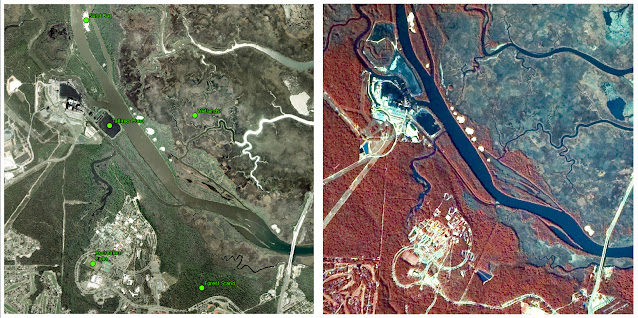
Lastly for this week, we make a comparison of a True Color aerial photograph and False Color or Near Infrared (NIR) aerial photograph.

True Color and False Color Air Photo Comparison

The True Color imagery of the University of West Florida campus and points north along the Escambia River shows the landscape under natural light, or what is visible with the naked eye. False Color is sensitive to near infrared and shows areas where more infrared energy is reflected with shades of red. By separating green, red and NIR bands, and applying a unique color for each, this allows one to more readily distinguish types of vegetation.