This week's Remote Sensing and Photo Interpretation lectures and lab assignment introduced a myriad of information related to image preprocessing. Functionality and various atmospheric correction techniques were discussed, followed by in depth look at several vegetation indices. The textbook provided great detail of the spectral characteristics of vegetation, including how visible light interacts with tree leaves and canopies.
The lab introduced data acquisition and the USGS Global Visualization Viewer (GloVis). There are a great many options with the web site, and we only scratched the surface with a single download of Landsat 4-5 TM data for the Pensacola area from 2011.
Next was an overview of Spatial Enhancement of raster data and a number of filters. Among other tasks, filters such as Fourier transform can be used to repair data such as with banding while convolution filtering can generalize data and sharpen data. Histograms can be utilized to omit unneeded data from analysis.
Working in ERDAS Imagine, I implemented a low pass filter on panchromatic imagery. This smooths out an image and is similar to the blur filter in Photoshop. It consolidates pixels within a 3x3, 5x5 or other kernal into an average, so local variation is reduced and "noise" removed. More specifically it takes the average digital number (DN) value of all cells within the kernal, and applies it the central kernal.
 |
| Unedited Panchromatic Imagery - Band 8 with wavelengths of 0.52-0.90 micrometers |
So some of the smaller details found across the rows and columns of pixels are reduced or eliminated while effects on larger scale features are minimal. When viewing imagery more broadly, this can aid in interpreting large-scale patterns. It also can correct for erroneous pixels, such as a stuck pixel in digital photography, where bad data or missing data may have occurred with the initial image generation.
 |
| Low Pass Filter image processing on Panchromatic Imagery |
Shifting to high pass filter on the same panchromatic imagery, this function accents features with edges while also enhancing linear features. It accentuates differences between one cell's DN and its neighboring cells. High levels of change for DN values from rows and columns of the imagery become more apparent.
 |
| High Pass Filter image processing on Panchromatic Imagery |
Also referred to as edge-enhancement, the high pass filter highlights boundaries between features, such as the edge of a forest stand by farmland or a shoreline. Sharpening the edges between objects aids in seeing small scale differences while reducing broad scale patterns. I equated this with the sharpen tool in Photoshop.
 |
| Convolution Filter with kernals of 3x3 Sharpen |
Within ArcGIS Pro, I used the Focal Statistics tool. Similar to Block Statistics, which calculates a new single cell value for every cell within a kernal, Focal Statistics calculates new values for every cell in the raster imagery.
There are several Statistic type options within the Focal Statistics geoprocessing tool. Using the Mean statistic type, the larger kernal resulted in each new cell value being the average of the larger area, resulting in a more generalized image.
 |
| ArcGIS Pro Geoprocessing tool Focal Statistics with a 7x7 kernal and Mean as the filter |
The Range statistic type, commonly referred to as Edge Detect, generates a new call value that reflects the difference or Spatial Frequency in DN values between adjacent cells. High DN values are assigned for pixels with high spatial frequencies, where the maximum value in the kernal is subtracted by the minimum value in the kernal. This tool can be used to reveal edges or borders between different types of features.
 |
| ArcGIS Pro Geoprocessing tool Focal Statistics with a 3x3 kernal and Range as the filter |
The last image preprocessing tool used this week was Image Histograms. The Histogram is a statistical graph comprising the total range of DN values, with spikes referencing high amounts of pixels (areas in the raster) that are outliers as compared to the homogeneous ranges for the bulk of the remaining pixels. The spikes can represent areas within the overall imagery where brightness values are very dark or very light as compared to the rest.
Adjusting the Radiometry in ERDAS Imagine using the Histogram breakpoints allows us to exclude pixel ranges outside of them from the imagery. This narrows down the brightness scale, with dark areas to the left and right areas to the right of the overall Histogram. Performing this operation can enhance the visualization of data.
When we adjust Levels in Photoshop, the Histogram is part of that filter. When a photo is visually too dark or blown out with light, adjusting the Levels can drop those extreme DN's from the visual presentation, improving the look. Having edited photos for 23 years on AARoads, I know better understand how this filter works!
 |
| Photo before preprocessing, large DN range beyond the histogram spike |
 |
| Processing the photo with the Levels filter using histogram, break points DN's adjusted to 8 and 211 |
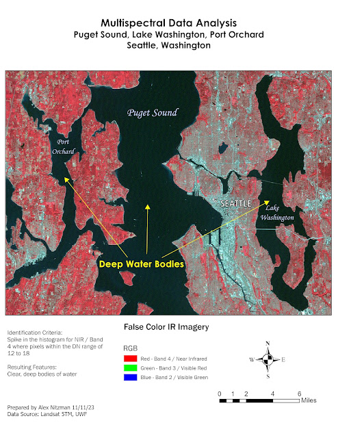
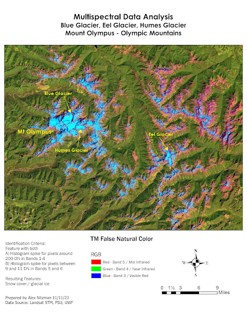
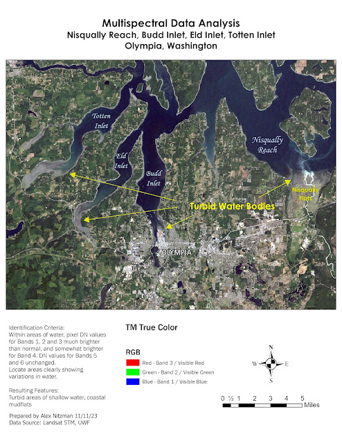
The following maps covering the Olympic Peninsula in Washington State from Seattle west to the Olympic Mountains. The lab tasks involved identifying features based upon three separate radiometric criteria. The data was from the Landsat 5 Thematic Mapper (TM) satellite, a multispectral sensor assigning the first seen spectral bands to the following spectral regions with wavelength frequencies in micrometers:
Band 1 / Blue visible light - 0.45-0.52
Band 2 / Green visible light - 0.52-0.60
Band 3 / Red visible light 0.63-0.69
Band 4 / Near Infrared (NIR) 0.76-0.90
Band 5 / Shortwave Infrared (SWIR) 1 - 1.55-1.75
Band 6 / Thermal 10.40-12.50
Band 7 / Shortwave Infrared (SWIR) 2 - 2.08-2.35
Once a feature is identified, the lab specified using the Create Subset tool to extract a corresponding area. Bringing the subset into ArcGIS Pro, colors for the spectral bands were assigned to enhance the visualization of the features to be identified.
The first map produced shows Seattle and areas of deep, clear water with low DN values. Using False Color IR imagery, where red is assigned to Near Infrared (NIR), the darker pixels with Puget Sound, Lake Washington and Port Orchard are easily distinguishable.


No comments:
Post a Comment