Friday, October 27, 2023

Land Use/Land Cover (LULC) Identification for Pascagoula, MS

The second module for GIS4035 Remote Sensing/Photo Interpretation introduces the USGS Land Use/Land Cover (LULC) classification system. Originally compiled by James R. Anderson and associates, A Land Use and Land Cover Classification System for Use with Remote Sensor Data was published by the United States Government Printing Office in 1976. There are four levels in the hierarchy, with Level I categorizing LULC on air photos with small scale and low spatial resolution. As Levels increase, so does the detail, corresponding with increases in spatial and spectral resolution and larger scale.

With additional increases in resolution and scale, LULC Level III further distinguishes features from the broader categories. This can be correlated to analyzing data at the city level as opposed to countywide. The numerical system of LULC Classification starts with the first number of code. The small scale categories for Level I are as follows:

  1. Urban or Built-up Land
  2. Agricultural Land
  3. Rangeland
  4. Forest Land
  5. Water
  6. Wetland
  7. Barren Land
  8. Tundra
  9. Perennial Snow or Ice
Representing a subcategory of Level I, Level II utilizes a second digit. For Urban or Built-up Land, 11 represents Residential areas, 12 Commercial and Services, 13 for Industrial areas, etc. Level III expounds classifications in Level II into more distinct categories. So for LULC 11 for Residential, LULC 111 is Single-family units (single family homes), 112 is Multi-family Units (duplexes, townhomes), 113 is Apartment Buildings.

Generally code information for Level I and II is readily available on the internet, starting with the 1976 Anderson Classification System document. The Modified Anderson LULC Classification used for the USGS National Land Cover Dataset however changes some of the verbiage used in the Level I and Level II classes while introducing an additional code set. This results in some confusion, as determining the final LULC codes, especially for Level III and especially Level IV becomes more tedious.

LULC Classification Codes for Level IV can vary, with some states setting their own code structure. Researching codes for Level III and Level IV revealed some of the differences between sets use for Florida, New Jersey and Oregon. Ultimately it appeared that the New Jersey classification scheme seemed to provide the most detailed Level IV data, which provides codes for discrete land types such as cemeteries or athletic fields for schools, areas that may be visually identified at the city level of an air photo.

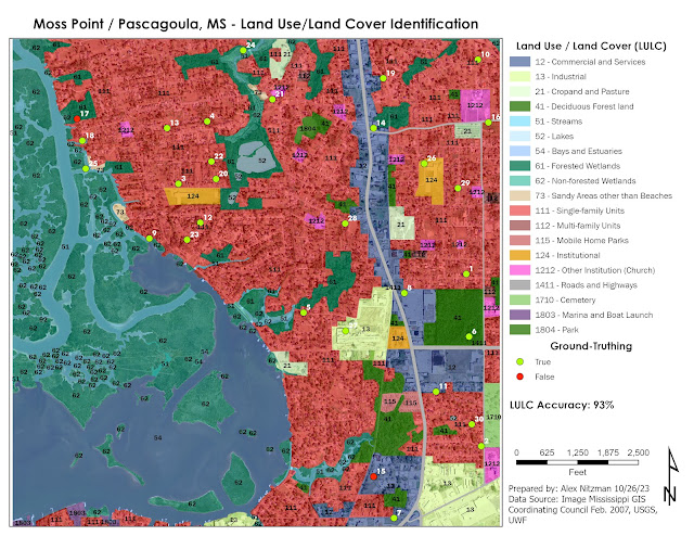
The lab for this week visually interprets an air photo of western reaches of Moss Point and Pascagoula along the East Pascagoula River in the Mississippi Gulf Coast. The resolution of the air photo was 16 square feet based upon the Stateplane coordinate system used. Based upon this the scale was set at 1:5,000. However after a good discussion during virtual office hours, the Minimum Mapping Unit (MMU) should have been 2 to 4 times greater than the 16 square foot cell size.

With the MMU selected, consistency should be followed. Since I had already analyzed 100% of the map by the time MMU was better explained, I opted to leave the Level III and IV classification polygons I derived from the larger scale.

Part of my analysis with more detail comes from years of studying aerial photography as a map researcher for Mapsource, Universal Map and AARoads. So it was acknowledged that skill sets for air photo interpretation can vary from individual to individual, and that my level of detail was still acceptable for this project.

LULC Classification and Ground-Truthing an Air Photo

With the LULC analysis complete, the next task was ground-truthing collection. Since the area of Jackson County, MS is not readily accessible for the class, imagery from Google Maps Street View (GMSV) and other sources of high-resolution aerial photography supplants the in-situ data collection.

Cross referencing the air photo with the historical imagery slider on Google Earth revealed that the photography was conducted in February 2007. This provided the temporal resolution for the ground-truthing exercise. GMSV went online in 2007, and the bulk of the coverage in Moss Point and Pascagoula dates back to 2008.

The majority of the sampling locations corresponded to readily accessible GMSV imagery. There were a few exceptions where some further interpretation was necessary. As for the sampling selection, bias was introduced due to the fact that around one third of the air photo covers areas of open waters or wetland areas outside of the GMSV range. So the extent used for the "create random points tool" in ArcGIS Pro focused on areas mostly inland. A tolerance was set at 16 feet, to provide a minimum distance between sampling locations.

Attempting to use the error matrix discussed in lecture, the LULC accuracy for the 30 points sampled was 93%. The goal of the exercise was general land use and land cover, and my selection of some discrete land use such as schools and churches, added some error potential to the overall accuracy forumlae.


Sunday, October 22, 2023

Remote Sensing - Visual Image Interpretation Basics

A short two days following the completion of the Final Project for GIS4043, I am delving into Photo Interpretation and Remote Sensing (GIS4035). The first lab provides an overview on elements of visual image interpretation, with historical black and white air photos of Pensacola Airport and Pensacola Beach in Northwest Florida.

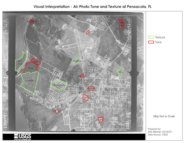
The first aspect of aerial photography interpretation references the tone, or the shades of gray from light/white to dark/black. Referencing the course textbook Remote Sensing of the Environment - An Earth Resource Perspective, tone is a function of the amount of light reflected. Consequently, the greater the absorption of the incident red light by forest stands results in a darker tone.

Large grassy areas, such as those within the Pensacola Airport grounds or for the runway safety areas, appear on the aerial below with a lighter tones. The soil in Escambia County is very sandy, and sand appears in a light tone. Areas by the airport where grading appeared to be underway at the time appear with a very light tone.

Tone and Texture Polygons on a B/W Air Photo
Texture is defined in the course textbook as the characteristic placement and arrangement of repetitions of tone or color in an image. With aerial photography, texture aids in identifying land areas populated by similar groups of objects. The definitions of texture range from fine/smooth, where an area is uniform or homogeneous, to intermediate/mottled, and rough/coarse where the contents of an area are heterogeneous.

Some of the examples identified in the Pensacola aerial included fine areas of smooth surface water in Escambia Bay and swatches of flat grassland. Texture increases with variation on the ground cover, such as areas within Pensacola Airport, to coarse areas of timber land located toward the bay front. The roughest areas of texture include subdivisions with the mixture of house footprints and tree canopies.

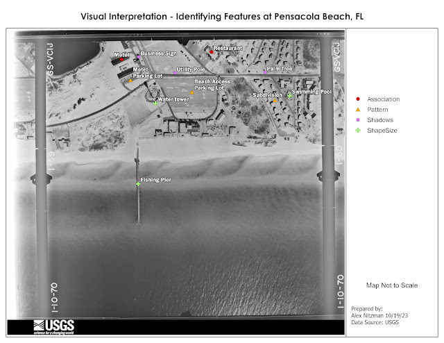
Next to consider when it comes to identifying features on an air photo are aspects of shape, size, pattern, shadows and association. Shape can be a dead give away in some instances, such as the Pensacola Beach fishing pier (one long since replaced due to hurricanes), with its linear appearance on the following aerial.

Identification by Size, Shape, Pattern, Shadow and Association
Shadows often provide insight into what an object may be, such as the Pensacola Beach Water Tower. Looking closer, smaller objects are indefinable based upon their shadow, such as palm trees because of the distinct shape of their fronds.

Like many things in life, appearances on the ground often result in a pattern, or a series of patterns. Striping for a parking lot creates a pattern of linear or angled spaces. A subdivision usually has some uniformity in the placement of houses and their orientation to each street.

Depending upon the area and prior knowledge, a more difficult element of visual interpretation is association. Association is highly variable and references the related surrounding of an object or activity.

Located north of the water tower, the association of the two linear buildings, adjacent parking areas and a swimming pool in between conveys that collectively the site is a motel. A likely restaurant is identified at the north end of the aerial photo based upon the association with the large parking lot and assorted vegetation immediately surrounding the building.

Lastly for this week, we make a comparison of a True Color aerial photograph and False Color or Near Infrared (NIR) aerial photograph.

True Color and False Color Air Photo Comparison

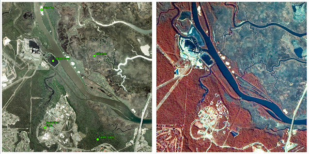
The True Color imagery of the University of West Florida campus and points north along the Escambia River shows the landscape under natural light, or what is visible with the naked eye. False Color is sensitive to near infrared and shows areas where more infrared energy is reflected with shades of red. By separating green, red and NIR bands, and applying a unique color for each, this allows one to more readily distinguish types of vegetation.


Friday, October 13, 2023

Bobwhite Manatee Transmission Line Analysis - Final Project

The final project for GIS4043/Intro to GIS conducts analysis on the Bobwhite Manatee Transmission Project in Southwest Florida. Part of the Florida Power & Light (FPL) infrastructure, the 24.5 mile long transmission corridor was developed to serve growing areas of eastern Manatee and Sarasota Counties, including Lakewood Ranch. Additionally the new line offers redundancy during hurricanes, something tested since it was completed with Hurricane Irma in 2017 and Hurricane Ian in 2022.

GIS analysis was used in part to determine the optimal location for the proposed transmission corridor. The design of the route took considerations for reducing impacts on sensitive or protected conservation land, avoiding schools and daycares, and providing a buffer from existing homes. Community input factored heavily with the corridor ultimately selected. FPL also worked with Schroeder-Manatee Ranch (SMR), the developer of the Lakewood Ranch community, to select a route that preserves the natural beauty of the area.

The study area was 273 square miles wide, mostly spread across central Manatee County along with a portion of northern Sarasota County. The project was announced by FPL in June 2006. With input from a community advisory panel, open house events and surveys mailed to area residents, FPL developed formal plans, which were unveiled in October 2006.

The Bobwhite Manatee Transmission Line project was eventually certified by the Florida Department of Environmental Protection. It subsequently cleared the Transmission Line Siting Act and was approved by the Florida Cabinet and Governor on October 28, 2008. Construction was anticipated to begin in 2010. It ultimately did in 2013, following additional compromises made between FPL, SMR, area homeowners and Taylor & Fulton, an area agricultural group.

Our project looks at four criteria analyzed by GIS for the selection of a preferred corridor for the transmission line. The first objective considered the number of homes and overall properties within proximity of the corridor.

Using the buffer geoprocessing tool, a 400-foot buffer was created around the preferred corridor of the planned transmission line. A feature class locating all homes within the corridor and associated buffer was next created with heads-up digitizing using 2006 aerial photography. With all visible homes added to GIS, running the "select by attribute" geoprocessing tool on created fields that indicated if a home was either within the corridor or within the 400-foot buffer, provided the totals. A map output of the homes and parcels intersecting the corridor:


The transmission line that was eventually built comes no closer to 600 feet from an existing home. No doubt GIS aided in achieving this buffer.

The second objective of GIS with the Bobwhite Manatee Transmission Line project was a simple one. Are their any schools or daycare centers within the preferred corridor, or the associated 400-foot buffer? Some work outside GIS was required to analyze this, as point feature classes for schools and daycares did not exist.

Researching area schools with the Department of Education website, and other websites for daycares falling within zip codes that crossed the preferred corridor, lists were compiled in Excel. These were in turn geocoded into GIS, using more recent street centerline files to complete address matching for automating the location process.

With school layers compiled, the select by attributes geoprocessing tool determined that no schools or daycare centers were within the preferred corridor or buffer:

That fact that FPL avoided all schools and daycares certainly reduced community opposition to the overall project.

Moving on with the analysis, environmental impacts to both conservation areas and wetlands was considered. National Wetlands Inventory (NWI) and Florida Managed Lands data were provided. The question to be answered is how many acres of each land type was within the preferred corridor?

For wetlands, the NWI feature class was clipped within the preferred corridor polygon. The result were records for uplands and two wetland types, with the Shape Area field providing the areas in square meters. After converting the values into acres, calculating the total acres of uplands and wetlands was easily achieved using the Summary Statistics geoprocessing tool.

Conducting spatial analysis on the conservation areas, a different approach was taken using the Select by Location geoprocessing tool with the Intersect relationship. This extracted all polygons in the conservation land feature class that were within the preferred corridor into a new feature class. The resulting data revealed that relatively small portions of a conservation easement, watershed and state park were in the preferred corridor:


The final objective analyzed by GIS was to estimate the total length of the then-future transmission line, and to use that figure in an equation to estimate construction costs. This was a straightforward process using the Polygon to Centerline geoprocessing tool.

However one data discrepancy occurred with the creation of the centerline feature class. The centerline split into separate branches within the triangular shaped wedge at the south end of the preferred corridor. I considered these to be outliers when it came to the determining the overall length of the transmission line.

One option was to take an average of the length between the two and consider adding that to the main centerline vector. Another option was to omit them entirely, as the project included constructing the Bobwhite Substation within that wedge shaped area.

GIS analysis determined an estimated total length of 24.76 miles. An East County Observer news article on the Bobwhite Manatee Transmission Line in 2013 referenced the line being built at the time as 24.5 miles in length. So this was a pretty good result from GIS.

Living in Bradenton from June 2013 to April 2015, I drove by this project several times without knowing much about it. While doing photography for AARoads, I captured work in progress along State Road 64. Looking back at the photos, what was built was a 230kV single circuit transmission line on a steel tubular pole. Using the equation provided with the GIS project documents, that resulted in a rate of $1.1 million per mile. The $27.236 million I calculated was well above the $20 million cost reported in the East County Observer article.

In conclusion, it appears that FPL designed the Bobwhite Manatee Transmission Line with a priority in the feedback from the community. The route was designed to follow existing right of way for several major highways. Using that space instead of a new corridor, the impacts to protected lands was minimized. Beside one home that was eventually demolished to make way for the Bobwhite Substation, it appears as if most existing homes were avoided by the power line.

Wrapping things up, beyond the deliverables posted above, we were tasked with creating a Power Point Slide Show presentation and accompanying transcript. Both are uploaded to my Google Drive:
Tuesday, October 3, 2023

Georeferencing UWF aerials for Eagles nest easement analysis

 The sixth lab for Intro to GIS introduces Georeferencing, which transforms raster data such as an aerial photo or a scan of a subdivision plat, to closely match vector data within GIS. I am familiar with Georeferencing from my cartography jobs, where we often acquired subdivision and other development plats and digitized them for updating map products.

Georeferencing utilizes control points, which match features on the raster image without any location data (coordinate system, latitude/longitude), to an existing vector data set in GIS. There are multiple methods of transformation with Georeferencing. The type of transformation used determines the correct map coordinate location for each cell within the raster data.

A lower order transformation, such as Zero Order Polynomial is used to simply shift data to better line a raster image with vector data. This is often the case if the spatial accuracy of the raster is similar to the vector data, or if the raster image was previously georeferenced and needs slight tweaking of its location to better match vectors. Correcting more complex distortion, higher order transformations allow raster data to bend and warp more.

This week's lab georeferences two aerial photographs of the University of West Florida (UWF) campus to feature layers for campus roads and buildings. I utilized a First-Order Polynomial transformation on the north aerial of the campus. First-Order is used to affine transformation to shift, scale or rotate raster data. Affine is defined in mathematics as "allowing for or preserving parallel relationships", so it more or less in this case scaled the raster image down to match the vector data without much in the way of distortion.

The south aerial of the UWF campus utilized a Second-Order Polynomial transformation. This was due to the aerial being intentionally distorted. Needing at least six control points, second order transformation is used where a raster dataset must be bent or curved to line up with vector data. We used ten control points.

Root Mean Square (RMS) Error was also introduced in this week's lab. RMS calculates the difference between where the from point was ultimately located opposed to the actual location specified. The value describes how consistent transformation is between the different control points. We were looking for RMS values of less than 15, any points exceeding that were beyond the accuracy tolerance.

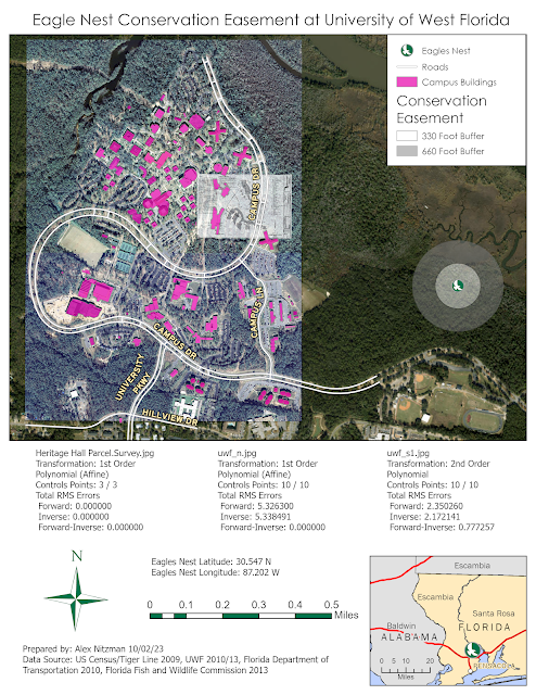
With georeferencing completed, I added a line feature for Campus Lane, a new road constructed since the original data was processed in 2010. I also digitized the new UWF gym, Building 72. With these features added, our next step was to introduce a multi-ring buffer around a nearby Eagles nest, a protected species. Located in an undeveloped area within UWF land to the east, our analysis added 330 foot and 660 foot buffers around the nest location representing two levels of conservation easement. These easements could affect construction of new buildings as part of planned expansion of the UWF campus.

The finished aerial map juxtaposes the existing UWF campus building structures with the conservation easement around the known Eagles nest location.

Aerial imagery and GIS data showing the UWF Campus and and Eagles nest easement