Module 3 for Computer Cartography builds on Module 2, where we started developing a routine for good map design with guidelines for labeling, annotation and layout text. Building upon that knowledge base, we focus on cartographic design, the method with which maps are conceived and created. The Gestalt Principles of perceptual organization factor into the design process for the Module 3 lab assignment.
There are several key concepts integral to the cartographic design process. Good design should meet the needs of map users and develop maps that are easy to interpret. Maps should be accurate and present data without distortion. Data should be legible and aesthetically pleasing, using either communicative or thought provoking symbols, color, layout and typographic appearance.
The design process focuses on how the data will be reproduced or disseminated. This initial factor helps determine the color scheme, map scale and the file format considered for potential printing methods. Next to strategize is how to classify the data and what symbolization to use. Ranking map elements, emphasizing what is most important and reducing the visual impact of the more irrelevant information contribute to the intellectual hierarchy of the map. The design process is repeated until the map is completed.
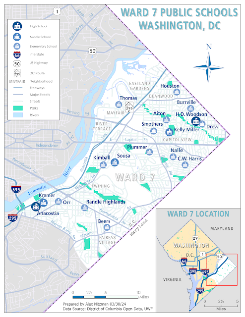
Our lab assignment for Module 3 was the production of a thematic map showing the locations of public schools within Ward 7 in Washington, DC. Following the aforementioned cartography design processes, the map emphasizes the public school locations using appropriate symbology, references major neighborhoods in Ward 7 and includes an inset map showing the location of Ward 7 with respect to the rest of the District of Columbia. We were free to decide on colors, typography, scale and general layout, ideally following Gestalt's Principles.
Visual Hierarchy is the first of the Gestalt Principles that influence good map production. It is the process of ranking map elements and symbols based upon their importance. The principles provide a guideline that emphasizes important features, such as the thematic symbols, title and legend, while reducing base information. What information in the map is relevant and what is not vital?
The general hierarchy for thematic maps provides a ranking system for map design. Thematic symbols and typography directly related to the map subject is the most important aspect. The title and legend are second, followed by the base information such as borders and location names. Rounding out the hierarchy are the scale and north arrow, data sources and other descriptive text, and then finally the map frame and neat lines.
For the Ward 7 map, school locations are the map subject, and therefore the most important. The visual weight reflects this, with size, color saturation and font width increased. Also implemented an ordinal scale where the high school symbology was the largest in size followed by middle and elementary. This may be considered redundant with the ordinal color scheme ranging from dark blue for high school to light blue for elementary. However with so much blue in the map, I opted to further distinguish schools by grade.
The second principle from Gestalt is Contrast, or the visual difference between map features. Changes in spacing, size, orientation, shape and color aid in providing contrast. Screening can also be implemented where graphics are lightened to reduce their visual weight.
Contrast is a concept that resonated with me, as it is something I had not considered as much with previous map creation. Reducing the visual impact of the less important features, such as the streets in Ward 7, and further areas in D.C. outside of Ward 7, reduce the distractions from the school locations in this week's map.
The Figure-Ground relationship is arguably the most impactful aspect of the Gestalt Principles. The concept is to give greater visual weight to map objects related to the subject, creating the illusion that they are closed to the map user. Methods to accomplish this include making point or line features darker than their surrounding and making important areas lighter than adjacent areas.
Designing a map with Figure-Ground in mind is another technique that I see with huge benefits. Making the important map elements, schools and neighborhood names, were central in producing the Ward 7 map. Furthermore while I decided to label major street names to provide context with the transportation network, I opted to use the same color for labeling to reduce their visual weight.
The concept of Color is to enhance map legibility. Important map objects should be assigned colors that stand out, lend meaning to the data to be presented, and with intuitive color choices. A general rule is to limit the number of hues used in a map, and instead focusing on adjusting lightness and saturation levels for disseminating map features. Also overly bright or saturated colors should be avoided, unless the map subject requires heavy emphasis.
The color selection was a challenge, as I opted to follow the recommendation of using fewer colors. With the Ward 7 map, I used a blue color pallet generated at the ColorBrewer web site. With a color scheme in mind, decorating features involved making some adjustments to lightness and saturation values. Lighter colors were used for background features and darker tones for important features. I kept the Anacostia Freeway as a darker stroke since it is considered one of the main arteries for eastern Washington.
When putting everything together, maintaining Visual Balance is key to prevent a map from appearing lopsided. This is accomplished by adjusting size, weight and the orientation of map elements within the map frame. These efforts make the map the center focus for the end user.
The angular shape of Washington and Ward 7 called for a portrait orientation for the map. This provided areas of white space to the top right and bottom right. The gray shaded area of Washington beyond Ward 7 was also space considered for map elements, since it is minimally relevant to the map subject.
Placing the inset was a logical decision to use the largest available white space. Placement of the legend was initially problematic, but I eventually opted to use areas of Washington away from Ward 7. While the map title is not centered, it uses the white space to the top right with a heavier font to counter the visual weight of the inset. Placed the scale bar, north arrow and data credits in a way to further balance the map.
A final aspect of the cartographic process mentioned in Cartography, is the Time it takes to create a map. This can be anything from a set deadline to no time limit at all. Being rushed can result from unrealistic deadlines or demands, where a cartographer cuts corners to save time. However, having unlimited time to work on a map can result in overthinking the design and endless iterations, hampering ever getting to a finished product.
When I read "endless iterations" this amply described the time and effort I put into the Ward 7 map. I spent around 20 hours or so working on this map, far more time than I anticipated. Rereading the lab assignment and the discussion board resulted in me repeatedly tweaking the colors, changing type annotation, readjusting the symbols and implementing ARCADE functionality.
Years ago I crafted a number of custom symbols, starting with route markers as EMF files. Knowing that D.C. has one signed route, 295 along the Anacostia Freeway, I wanted to show that with the proper shield. ArcGIS Pro does not use EMF files, and instead uses PNG and SVG files to produce Shape Markers.
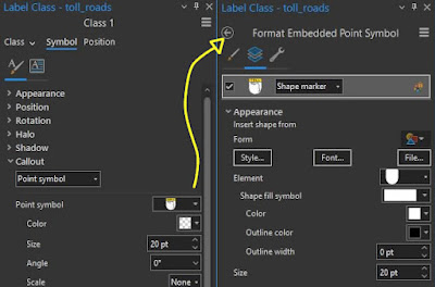
Creating a custom symbol can be done within the Label Class pane. Below Callout, the Point Symbol shows the image used for the symbol. Following the dropdown option "Format Point Symbol", the Format Embedded Point Symbol dialog opens. There choosing Shape marker and selecting a File below the Form section brings in the desired PNG or SVG file. Make adjustments to the size, scaling, offsets, and when finished, "Save symbol to style" under the hamburger menu on the Label Class pane adds it to favorites in Catalog under Styles.
Creating the legend was also a time investment, as I wanted to show the neighborhood text as a legend item along with the route markers. Since I could find no way on how to have ArcGIS Pro to that, I instead followed the advice written on the ESRI community forum and elsewhere to manually create the legend starting with a blank rectangle.
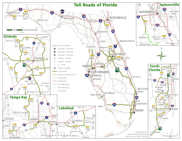
Wanting to work on my skillset further, and in an effort to reinforce the Gestalt Principles in my map design, I spent an additional 8 hours putting together a separate map. The map concept came to me while on the treadmill last week, so that gave me a basis to work with, but starting from scratch was somewhat difficult. Nonetheless, following several adjustments and exports, I completed a map showing the Toll Roads of Florida.
Working with the shape of Florida, I attempted to balance the insets of major metro areas. The population scale is the old Gousha map classification derived from my old style file from ArcMap. Gousha was a national map company that was subsumed by Rand McNally in the late 1990s.


No comments:
Post a Comment