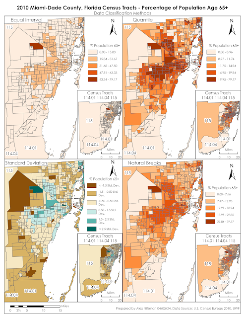
Module 4 for Computer Cartography contrasts 2010 Census Data for Miami-Dade County, Florida using multiple data classification methods. Our objective is to distribute quantitative data into thematic maps based upon two criteria. The first series of maps shows the percentage of the total population per Census Tract of the number of seniors aged 65 and older. The second map array uses normalized data to partition Census Tracts based upon the number of seniors per square mile.
When analyzing data distribution, it is important to understand that many geographical phenomena results in an array of values that can be represented by a bell-shaped curve. This is also referred to as "normal distribution." With normally distributed data, data values further away from the mean are much less frequent than those occurring nearer the mean.
Data classification is a topic that I have limited experience with. This lab required me to do additional research beyond the lectures and the textbook Cartography, to better understand the methods. Based upon online articles read and the course material, the four data classification methods for this lab can be defined as follows.
Equal Interval
The Equal Interval data classification method creates equally sized data classes for a feature layer based upon the range between the lowest and highest values. The number of classes is determined by the user. A simple way to understand this is if there were data with values ranging from 0 to 100, Equal Interval set to 4 classes would create classes with data ranges of 25 for each.
Equal Interval data classification is optimal for continuous datasets where data occurs throughout a geographic area, such as elevation, precipitation or temperature. The method is easily understandable and can be converted manually. However with unequal distribution of data, Equal Interval can result in classes with no data or classes with substantially more data than others.
Quantile
Similar to Equal Interval, the Quantile data classification method results in classes with an equal number of data values, but instead based upon the number records in an attribute table. That is, for a feature layer with 100 records, Quantile classification with five classes partitions the data into classes with 20 records a piece.
Furthermore, identical records cannot be placed in separate classes, nor will empty data classes be created. It also can place similar data values in different classes or very different values in a single class. Adjusting the number of classes can improve upon this.
Quantile data classification is good about showing the relative position of data values, such as where the highest concentration of data is located. It depicts variability, even if there is little within the data.
Standard Deviation
Standard Deviation is the average amount of variability within a dataset from the data mean, or in simpler terms, how spread out are the data values. The Standard Deviation data classification method adds and subtracts the standard deviation from the dataset mean to generate classes. These usually indicate how far data values diverge from the mean.
A disadvantage to implementing Standard Deviation method is that the data needs to be normally distributed. Data Normally distributed has a symmetrical bell shape where the mean and median are equal and both located at the center of the distribution. The empirical rule for normal distribution indicates that 68% of the data is within 1 standard deviation of the mean, 95% is within 2 standard deviations of the mean and 99.7% is within 3 standard deviations of the mean.
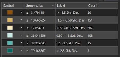
For our lab, the mean of the data for the percentage of seniors within the overall Census Tract population is 14.26%. The standard deviation is 7.19, so 207 of the 519 tracts of Miami-Dade County have senior population rates between 17.85% and 25.04%. The class showing a standard deviation between -1.5 (-10.78%) and -0.5 (-3.59%), shows Census tracts where the senior population makes up between 3.49% and 10.67%, or another 151 tracts of Miami-Dade County. Viewing a thematic map based upon standard deviation reveals where the average number of seniors are located juxtaposed with areas that have less and more than that average.
Natural Breaks
The Natural Breaks data classification method separates data into groups where values are minimally different in the same class. Focusing on the natural gaps within a data set, the differences between classes however, are maximized. The aim of Natural Breaks is to determine logical separation points so that naturally occurring clusters are identified.
Natural Breaks works well with unevenly distributed data where values are not skewed toward the end of the distribution The method can still result in classes with a wide range of values. Manually adjusting the break values can be used to offset this or remove the gaps between classes.
A solid grasp of these methods is needed to provide adequate data analysis. Admittedly, I will benefit from further work with creating maps using these data classification methods to better understand their utility.
The Module 4 lab assignment tasks us to make an assessment as to which of the classification methods best displays the data for an audience seeking to market to senior citizens. Further, the lab questions which is the more accurate criteria for data distribution, classifying the population by the percentage of seniors per tract, or using the normalized data where data indicates the number of seniors per area in square miles?
The most accurate display of senior citizen population in Miami-Dade County, Florida is derived from the Natural Breaks data classification method. The thematic map clearly shows the urban areas that represent the highest concentration of the population aged 65 plus. The upper data classes are reserved for just 42 Census tracts while classes showing the mid-range population rate draw the most visual weight.
An audience targeting the senior citizen population may benefit from the Quantile data classification since it shifts the classification scale lower, with 441 seniors per square mile as the starting point for the 2nd class versus 872 seniors per square mile that Natural Breaks generates. This might be a better distribution of the data from an audience stand point.
Having a better understanding of Standard Deviation after writing this blog post, that data classification method adequately shows areas of Miami-Dade County where senior population is below average. The thematic map generally matches the Quantile and Natural Breaks maps in displaying areas of typical and above average senior population.
Which is more preference really depends upon the needs of the end user. A drawback to the Standard Deviation thematic map is that the color pallet for below average senior population tracts dominates the visual aesthetics.
The normalized data based upon the population of seniors per square mile offsets outliers generated by simply using the percentage of seniors per Census Tract. That is because the percent of seniors per tract does not give an indication of how many that number represents. The tract with the highest percentage of seniors represents 95 out of 120 people. Thematic maps for all four data classification maps showed that tract as being the highest concentration of seniors, despite the very rural population statistics:


No comments:
Post a Comment