Module 5 for Computer Cartography advances our understanding and usage of choropleth maps while introducing us to proportional and graduated symbol map types.
A choropleth map can be described as a statistical thematic map showing differences in quantitative area data (enumeration units) using color shading or patterns. Choropleth maps are not to be used to map totals, such as ones based on unequal sized areas or unequal sized populations. Instead data should be normalized using ratios, percentages or another comparison measure.
Proportional symbol maps show quantitative differences between mapped features. This is the appropriate map type designed for totals. The map type shows differences on an interval or ratio scale of measurement for numerical data. Symbols are scaled based upon the actual data value (magnitude) occurring at point locations instead of a classification or grouping.
Graduated symbol maps also show quantitative differences in data, but with features grouped into classes of similar values. Differences between features use an interval or ratio scale of measurement. The data classifications use a scheme that reflects the data distribution similar to a choropleth map. Previously discussed data classification methods, such as Equal Interval and Quantile, can be applied to generate classes.
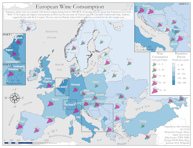
Our lab for Module 5 was the creation of a map dually showing the population density of people per square kilometer and wine consumption at the rate of liter per capita for countries in Europe. A dual choropleth map will display population densities for the continent while a graduated or proportional symbol map will quantify wine consumption rates for each country.
The lab exercise tasks included the creation of both a proportional symbol map and a graduated symbol map of Europe. The ultimate map type used to portray the country data is partly based upon the anticipated ease of a map user to visually interpret the maps.
Generating a proportional map in ArcGIS Pro is a more rigid process with less user options. The scale classifications are preset to five breaks partitioning data into ranges of 20%. However, the feature class labels are not clearly understood, as the range array is 1, 2.5, 5, 7.5 and 10. The minimum size of the symbol proportionally determines the maximum value.
The raw and mostly unstylized output of the Proportional Symbol Map, with arbitrary values showing the rank of counties in wine consumption from lowest to highest, while the sizes convey the actual wine consumption rate of liters per capita:

A graduated symbol map for this assignment provided more flexibility with various methods of classification, more easily understood class separations and automatically generated labels, the ability to adjust classes using Manual Breaks, and absolute control over setting symbol sizes. The final output:

An added aspect of this lab was the introduction of picture symbols, which can be used in place of the default ArcGIS symbol set. Picture symbols allow for more personalized customization to a map, as long as they appropriately distinguish between differences of data magnitude.
Using a blue color palette from the Color Brewer web site, used the Natural Breaks data classification method to generate the choropleth map of European countries by population. The graduated symbol element of the map uses picture symbols that I created in Adobe Illustrator based off the Winery sign specifications used on Florida roads.

The winery icons incorporate a color scheme to aid in visually distinguishing the differences in data magnitude. The highest wine consumption rate equates to the largest symbol size where all grapes in the graphic are colored magenta. The next tier down in order reduces the symbol size by 15% and the proportion of graphics colored magenta versus those shaded green.
A series of three insets were created to better show detail on some of the smaller countries or groups of countries. These required some data exclusion so as not to conflict with data on the main map frame. Prior to creating the insets, I used the Polygon to Point geoprocessing tool to generate a separate point feature class for the graduated symbols. This provided me with the flexibility to relocate the placement of symbols in addition to the option of moving annotated text for the final layout.
The inset creation utilized a definition query with the SQL expression "not including values(s)", where wine consumption data for countries not to be displayed were omitted from the respective inset dataset. The annotation layer for the main map frame was also replicated for each inset to reduce conflict and speed up labeling time.
Chose Garamond font to give a more elegant look to the final map, since the wine is often equated with fine dining or culture. Additionally the blue color palette was specifically selected so as not to contrast with the color of the winery symbols.


No comments:
Post a Comment