Monday, April 29, 2024

Google Earth and a Video Tour of Florida Cities

The final module of Computer Cartography returns us to Google Earth to work with KML (Keyhole Markup Language) files and explore some additional functionality of the software. We previously used Google Earth with data collected using ArcGIS Field Maps and a KML file of point data imported from ArcGIS.

The use of KML files with Google Earth allows us to share geographic data with a general audience that may have zero to little GIS expertise or experience. ArcGIS provides a method to convert a feature class to a KML file with the Layer to KML  Geoprocessing Tool. Within ArcGIS Online, it is a simpler process of using the option Export to KML. 

Lecture materials for Module 7 cover several aspects of 3D mapping. The videos showed some of the potential advantages of displaying data in 3D and also with using 3D data for analysis. Examples included showing water consumption data in Merced County, California with space-time cubes, where x,y coordinates represent the location and the z coordinates represent time (years). Classified LiDAR data allows a GIS Analyst to interactively make measurements, such as the height of powerlines or an overpass.

Another function in GIS introduced is animations or fly throughs using 3D data. This is further explored in Lab7 with the use of the 3D Mapping component of Google Earth and the creation of a Tour video covering Florida metropolitan areas and cities from the Suncoast to South Florida.

Outside of what was covered in GIS4043, my previous experience with Google Earth mostly comprised using historical imagery to compare archived air photos with more recent imagery. This week's Lab was somewhat challenging in parsing through the Places folder structure and the Temporary Places folder set added during each Google Earth session.

The initial task with the Lab was classifying a provided hydrology feature class and assigning appropriate symbology for water type. This data in turn was converted to a KML for use in Google Earth. Also supplied for the Lab was a Legend .png file and KML files for dot density for population and county boundaries.

All KML files were compiled in Google Earth, but the map legend required manual placement. This was accomplished using the Image Overlay tool, which utilizes a "GroundOverlay" to place an .jpg or .png file. Classmate Michael Lucas made an informative post on the class discussion board about instead creating a  a "ScreenOverlay". I was unsure how to accomplish this and opted to edit the XML of the KML file, changing <GroundOverlay> to <ScreenOverlay>. This was somewhat successful except for that the ScreenOverlay graphic was disproportionately large in context. I discarded it for the final output for Lab.
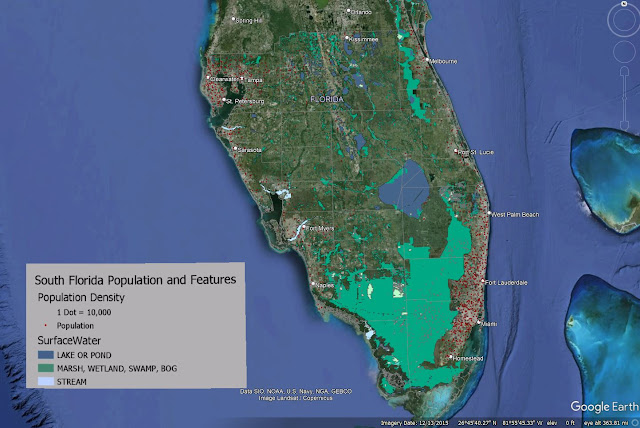
Screenshot of Google Earth Map covering South Florida hydrology and population density
The KML files and legend used for my Google Earth video tour of South Florida

With the legend in place, our next task was to create an array of bookmarks for various Florida metropolitan areas and city centers. The bookmarks were in turn used as part of a video tour, where Google Earth starts with an overview of southern Florida, and then proceeds to do fly throughs to the places bookmarked. 3D rendering of buildings in Downtowns were included as part of the tour.

Being that I am somewhat of a novice with the controls of Google Earth, I took the suggestion of using some of the keyboard shortcuts to navigate. Keyboard shortcuts are a must for online gaming, and hotkeys are also quite helpful with familiar software applications. However, usage of keyboard shortcuts requires substantial practice to be overall effective with it. As my video showed, I clearly have room for improvement.

The tour ultimately zoomed into the Miami metropolitan area and panned around Downtown Miami before moving north to Fort Lauderdale and then onto the Tampa Bay area. The video showed some choppiness where it appears I went back and forth with the navigation. This may be a drawback with graphics processing or the software, but those effects exaggerated some of my movements.

A visual aspect of the tour allows one to turn on and off layers as desired throughout the course of the video. Other options I explored included changing the speed at which Google Earth zooms in and out, and how responsive the navigation controls are. Clearly, more improvements can be made, but this goes hand and hand with experience.

My Google Earth files for Module 7 are uploaded to Google Drive:

Saturday, April 20, 2024

Isarithmic Mapping - Washington State Precipitation

The semester is accelerating and we move into the 6th lab covering Isarithmic Mapping! Following choropleth mapping, this thematic map type is the second most widely used in cartography. Isarithmic maps consider geographic phenomenon to be continuous and smooth, with measurements in the area of interest presumed to change gradually between data point locations instead of abruptly. There are two primary types of isarithmic mapping.

Often associated with meteorology, isometric maps depict smooth, continuous phenomenon, such as temperatures, rainfall, barometric pressure and wind velocity derived from data occurring at true points where values are actually measured at that location. The most common form of isometric maps are contour maps, which are lines marking equal value across a geographical area.

Collectively, contours used in isometric maps can be referred to as isolines. Iso in Latin means equal or the same. Variations of isoline terminology include isobars for lines of equal barometric pressure, isotherms for lines of equal temperature and isodrosotherms for lines of equal dew point.

Isopleth maps are comprised from data that occurs over geographic areas using conceptual points, where values are presumed to be at point locations. Isopleth maps show variations in quantity of features as a surface. The volume can be represented using contour lines or by filled contours with color shading representing quantitative values. Data for isopleth maps must be standardized to account for the area in which the data was collected.

Various interpolation methods on raster data sets are implored in the creation of isopleth maps. These methods generate data values over a given area using samples measured at control points. An algorithm in turn processes the data to predict the values of unknown points on an isopleth map. Values between the control points are predicted under the premise that spatially distributed objects are spatially correlated. Also referenced as the Concept of Spatial Auto Correlation, this basis of interpolation assumes that values of locations close together tend to share similar characteristics than those located farther apart.

The focus of lab this week is the creation of an isopleth map showing the average annual precipitation for a 30 year period across the state of Washington. The provided dataset was derived using PRISM, an inverse distance weight (IDW) interpolation method developed by the University of Oregon.

Washington Precipitation map using Hypsometric Tinting

The Parameter-elevation Regressions on Independent Slopes Model (PRISM) stresses elevation as the most important aspect in a localized region for the distribution of climate variables such as rainfall, temperature and dew point. The model calculates a climate-elevation relationship for each cell of a raster data set based upon data from nearby weather stations. The regression function used with the IDW method weights station data points to incorporate a wide range of physiographic variables that have a direct correlation with precipitation amounts and other climatological aspects.

Two types of isarthmic maps were created in Lab 6. The first was a continuous tone map, where geographic surfaces represent the values that exist across an entire area. Data collected at sample points, by mapping the density of points or the values they represent, factor into the interpolation that generates the continuous surface. This method portrays a more fluid appearance where data values in a raster set gradually transition from cell to cell.

The second was Hypsometric Tint, which reminds of me of the Futurama character the Hypnotoad, that classifies data into bands. These bands represent a method of coloring different values to enhance changes, such as in elevation with a Digital Elevation Model (DEM).

Using contours, hypsometric tint separates raster data into bands with uniform data values. These bands can represent a single value, or a range of values with lower and upper limits. An advantage of hypsometric tint is that changes in data are more clearly visualized over the smooth transitions of a continuous tone map. A drawback is that local variation of data values is lost with the generalization between contours.

The hypsometric tint map of Washington precipitation projected in State Plane coordinates.

Reprojecting the Washington precipitation data into State Plane coordinates, I ran through the lab again to create a second map showing Washington in a more aesthetically pleasing projection. This both gave me more practice with creating continuous tone and hypsometric tint maps, but also some of the difficulties with projecting data, as the hillside shading values changed from using world statistics to local statistics.

PRISM

PRISM was initially developed in 1991. Enhancements over time garnered the interest of the USDA Natural Resources Conservation Service (NRCS), which sought improvements for updated digital precipitation maps. With funding support, PRISM precipitation maps were generated for the Pacific Northwest and Intermountain West region of the U.S., where topographic features made mapping precipitation complex.

State Climatologists evaluated the maps produced by PRISM, offering their own suggestions for improvements. Following two years of trial and error, they concurred that PRISM produced maps equaling or exceeding previous ones produced by hand. The result is that the NRCS utilized PRISM to map averages for temperature and precipitation nationwide for the period from 1961 to 1990.

Sources:

Daly, C., & Bryant, K. (n.d.). The PRISM Climate and Weather System – An Introduction. University of Oregon. Retrieved April 20, 2024, from https://www.prism.oregonstate.edu/documents/PRISM_history_jun2013.pdf

The Hypnotoad may or may not approve of hypsometric tint!

via GIPHY

Monday, April 15, 2024

Hybrid Mapping - Choropleth and Graduated Symbols

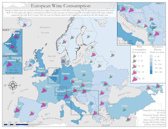
Map showing population density vs wine consumption for European countries

Module 5 for Computer Cartography advances our understanding and usage of choropleth maps while introducing us to proportional and graduated symbol map types.

A choropleth map can be described as a statistical thematic map showing differences in quantitative area data (enumeration units) using color shading or patterns. Choropleth maps are not to be used to map totals, such as ones based on unequal sized areas or unequal sized populations. Instead data should be normalized using ratios, percentages or another comparison measure.

Proportional symbol maps show quantitative differences between mapped features. This is the appropriate map type designed for totals. The map type shows differences on an interval or ratio scale of measurement for numerical data. Symbols are scaled based upon the actual data value (magnitude) occurring at point locations instead of a classification or grouping.

Graduated symbol maps also show quantitative differences in data, but with features grouped into classes of similar values. Differences between features use an interval or ratio scale of measurement. The data classifications use a scheme that reflects the data distribution similar to a choropleth map. Previously discussed data classification methods, such as Equal Interval and Quantile, can be applied to generate classes.

Our lab for Module 5 was the creation of a map dually showing the population density of people per square kilometer and wine consumption at the rate of liter per capita for countries in Europe. A dual choropleth map will display population densities for the continent while a graduated or proportional symbol map will quantify wine consumption rates for each country.

The lab exercise tasks included the creation of both a proportional symbol map and a graduated symbol map of Europe. The ultimate map type used to portray the country data is partly based upon the anticipated ease of a map user to visually interpret the maps.

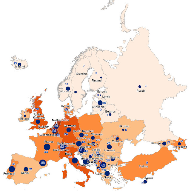
Generating a proportional map in ArcGIS Pro is a more rigid process with less user options. The scale classifications are preset to five breaks partitioning data into ranges of 20%. However, the feature class labels are not clearly understood, as the range array is 1, 2.5, 5, 7.5 and 10. The minimum size of the symbol proportionally determines the maximum value.

The raw and mostly unstylized output of the Proportional Symbol Map, with arbitrary values showing the rank of counties in wine consumption from lowest to highest, while the sizes convey the actual wine consumption rate of liters per capita:

Proportion Symbol Map of Europe

A graduated symbol map for this assignment provided more flexibility with various methods of classification, more easily understood class separations and automatically generated labels, the ability to adjust classes using Manual Breaks, and absolute control over setting symbol sizes. The final output:

Map showing population density vs wine consumption for European countries

An added aspect of this lab was the introduction of picture symbols, which can be used in place of the default ArcGIS symbol set. Picture symbols allow for more personalized customization to a map, as long as they appropriately distinguish between differences of data magnitude.

Using a blue color palette from the Color Brewer web site, used the Natural Breaks data classification method to generate the choropleth map of European countries by population. The graduated symbol element of the map uses picture symbols that I created in Adobe Illustrator based off the Winery sign specifications used on Florida roads.

Picture Symbols Created for the European Wine Map

The winery icons incorporate a color scheme to aid in visually distinguishing the differences in data magnitude. The highest wine consumption rate equates to the largest symbol size where all grapes in the graphic are colored magenta. The next tier down in order reduces the symbol size by 15% and the proportion of graphics colored magenta versus those shaded green.

A series of three insets were created to better show detail on some of the smaller countries or groups of countries. These required some data exclusion so as not to conflict with data on the main map frame. Prior to creating the insets, I used the Polygon to Point geoprocessing tool to generate a separate point feature class for the graduated symbols. This provided me with the flexibility to relocate the placement of symbols in addition to the option of moving annotated text for the final layout.

The inset creation utilized a definition query with the SQL expression "not including values(s)", where wine consumption data for countries not to be displayed were omitted from the respective inset dataset. The annotation layer for the main map frame was also replicated for each inset to reduce conflict and speed up labeling time.

Chose Garamond font to give a more elegant look to the final map, since the wine is often equated with fine dining or culture. Additionally the blue color palette was specifically selected so as not to contrast with the color of the winery symbols.

Sunday, April 7, 2024

Thematic Mapping - Data Classification Methods

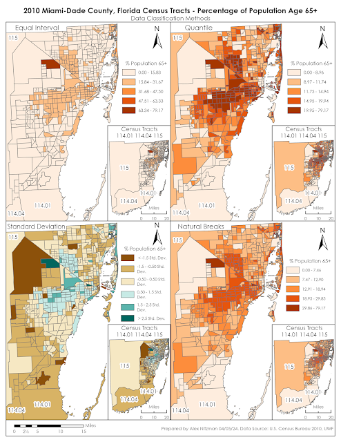
Module 4 for Computer Cartography contrasts 2010 Census Data for Miami-Dade County, Florida using multiple data classification methods. Our objective is to distribute quantitative data into thematic maps based upon two criteria. The first series of maps shows the percentage of the total population per Census Tract of the number of seniors aged 65 and older. The second map array uses normalized data to partition Census Tracts based upon the number of seniors per square mile.

When analyzing data distribution, it is important to understand that many geographical phenomena results in an array of values that can be represented by a bell-shaped curve. This is also referred to as "normal distribution." With normally distributed data, data values further away from the mean are much less frequent than those occurring nearer the mean.

Data classification is a topic that I have limited experience with. This lab required me to do additional research beyond the lectures and the textbook Cartography, to better understand the methods. Based upon online articles read and the course material, the four data classification methods for this lab can be defined as follows.

Equal Interval

The Equal Interval data classification method creates equally sized data classes for a feature layer based upon the range between the lowest and highest values. The number of classes is determined by the user. A simple way to understand this is if there were data with values ranging from 0 to 100, Equal Interval set to 4 classes would create classes with data ranges of 25 for each.

Equal Interval data classification is optimal for continuous datasets where data occurs throughout a geographic area, such as elevation, precipitation or temperature. The method is easily understandable and can be converted manually. However with unequal distribution of data, Equal Interval can result in classes with no data or classes with substantially more data than others.

Quantile

Similar to Equal Interval, the Quantile data classification method results in classes with an equal number of data values, but instead based upon the number records in an attribute table. That is, for a feature layer with 100 records, Quantile classification with five classes partitions the data into classes with 20 records a piece.

Furthermore, identical records cannot be placed in separate classes, nor will empty data classes be created. It also can place similar data values in different classes or very different values in a single class. Adjusting the number of classes can improve upon this.

Quantile data classification is good about showing the relative position of data values, such as where the highest concentration of data is located. It depicts variability, even if there is little within the data.

Standard Deviation

Standard Deviation is the average amount of variability within a dataset from the data mean, or in simpler terms, how spread out are the data values. The Standard Deviation data classification method adds and subtracts the standard deviation from the dataset mean to generate classes. These usually indicate how far data values diverge from the mean.

A disadvantage to implementing Standard Deviation method is that the data needs to be normally distributed. Data Normally distributed has a symmetrical bell shape where the mean and median are equal and both located at the center of the distribution. The empirical rule for normal distribution indicates that 68% of the data is within 1 standard deviation of the mean, 95% is within 2 standard deviations of the mean and 99.7% is within 3 standard deviations of the mean.

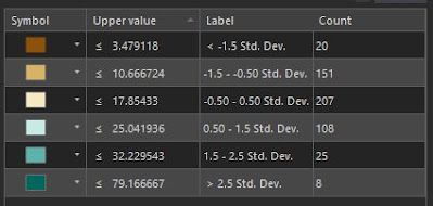
For our lab, the mean of the data for the percentage of seniors within the overall Census Tract population is 14.26%. The standard deviation is 7.19, so 207 of the 519 tracts of Miami-Dade County have senior population rates between 17.85% and 25.04%. The class showing a standard deviation between -1.5 (-10.78%) and -0.5 (-3.59%), shows Census tracts where the senior population makes up between 3.49% and 10.67%, or another 151 tracts of Miami-Dade County. Viewing a thematic map based upon standard deviation reveals where the average number of seniors are located juxtaposed with areas that have less and more than that average.

Miami-Dade Standard Deviation for the percent of seniors per Census Tract


Natural Breaks

The Natural Breaks data classification method separates data into groups where values are minimally different in the same class. Focusing on the natural gaps within a data set, the differences between classes however, are maximized. The aim of Natural Breaks is to determine logical separation points so that naturally occurring clusters are identified.

Natural Breaks works well with unevenly distributed data where values are not skewed toward the end of the distribution The method can still result in classes with a wide range of values. Manually adjusting the break values can be used to offset this or remove the gaps between classes.

A solid grasp of these methods is needed to provide adequate data analysis. Admittedly, I will benefit from further work with creating maps using these data classification methods to better understand their utility.

The Module 4 lab assignment tasks us to make an assessment as to which of the classification methods best displays the data for an audience seeking to market to senior citizens. Further, the lab questions which is the more accurate criteria for data distribution, classifying the population by the percentage of seniors per tract, or using the normalized data where data indicates the number of seniors per area in square miles?

The most accurate display of senior citizen population in Miami-Dade County, Florida is derived from the Natural Breaks data classification method. The thematic map clearly shows the urban areas that represent the highest concentration of the population aged 65 plus. The upper data classes are reserved for just 42 Census tracts while classes showing the mid-range population rate draw the most visual weight.

An audience targeting the senior citizen population may benefit from the Quantile data classification since it shifts the classification scale lower, with 441 seniors per square mile as the starting point for the 2nd class versus 872 seniors per square mile that Natural Breaks generates. This might be a better distribution of the data from an audience stand point.

Miami-Dade County Census Maps showing senior population by area

Having a better understanding of Standard Deviation after writing this blog post, that data classification method adequately shows areas of Miami-Dade County where senior population is below average. The thematic map generally matches the Quantile and Natural Breaks maps in displaying areas of typical and above average senior population.

Which is more preference really depends upon the needs of the end user. A drawback to the Standard Deviation thematic map is that the color pallet for below average senior population tracts dominates the visual aesthetics.

The normalized data based upon the population of seniors per square mile offsets outliers generated by simply using the percentage of seniors per Census Tract. That is because the percent of seniors per tract does not give an indication of how many that number represents. The tract with the highest percentage of seniors represents 95 out of 120 people. Thematic maps for all four data classification maps showed that tract as being the highest concentration of seniors, despite the very rural population statistics:

Thematic maps showing Miami-Dade County Census data based upon the percentage of seniors


Tuesday, April 2, 2024

Cartographic Design - Gestalt Principles of Perceptual Organization

Module 3 for Computer Cartography builds on Module 2, where we started developing a routine for good map design with guidelines for labeling, annotation and layout text. Building upon that knowledge base, we focus on cartographic design, the method with which maps are conceived and created. The Gestalt Principles of perceptual organization factor into the design process for the Module 3 lab assignment.

There are several key concepts integral to the cartographic design process. Good design should meet the needs of map users and develop maps that are easy to interpret. Maps should be accurate and present data without distortion. Data should be legible and aesthetically pleasing, using either communicative or thought provoking symbols, color, layout and typographic appearance.

The design process focuses on how the data will be reproduced or disseminated. This initial factor helps determine the color scheme, map scale and the file format considered for potential printing methods. Next to strategize is how to classify the data and what symbolization to use. Ranking map elements, emphasizing what is most important and reducing the visual impact of the more irrelevant information contribute to the intellectual hierarchy of the map. The design process is repeated until the map is completed.